Architect to the Rescue

House Triage

There’s a unique challenge in being called in to rescue a project from a flawed design. It’s different than doing a great design from the beginning, I have a given design to work with and am charged with coming up with fixes to give the house a creative uplift. It’s more like triage on a wounded patient.

Patient #1.    This house above was under construction, but the owner felt from the renderings that he wasn’t happy with how the front looked. He asked me to come up with something with a more modern feel.

Diagnosis:    The double height columns were trying to look grand, but the scale was in fact overwhelming the rest of the facade. The boxy stone shapes holding up that small roof was badly proportioned. And at that height, the roof wasn’t going to provide any real protection from rain or sun at the entry.

Cure:    Our lower and broader roof canopy provides both functional protection and a more enticing and welcoming entry, better proportioned to the facade. It also allows the upper level to read across the elevation, making the house actually seem larger. We added a transom window above the doors and sidelights to give the entry more presence. The stone on the columns is brought down to align with the stone on the house, and the thin steel columns give a floating appearance to the flat roof.

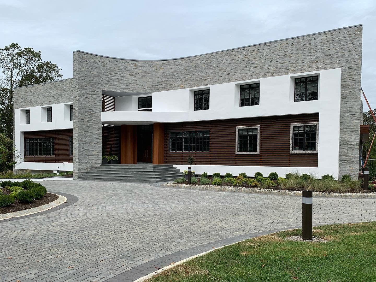
Patient # 2.    In this example below, I was contacted by a client who’s new house was almost complete. The problem was that she didn’t at all like how the exterior was shaping up, and had lost confidence in her architect to find a good solution. It’s a very large house, somewhat modern in design, but felt more like an institutional building than a house. There were several renderings of options for applied surfaces to try to give the house some character, but nothing really worked to conceal the basic flaw of the house.

This client found me and was determined that I was the person she needed to fix this problem. Always up for a challenge, I agreed to meet her to discuss what could be done. I agreed to take it on, but had no idea what I’d be able to do to make this house look worthy of the large expense that had already been spent.

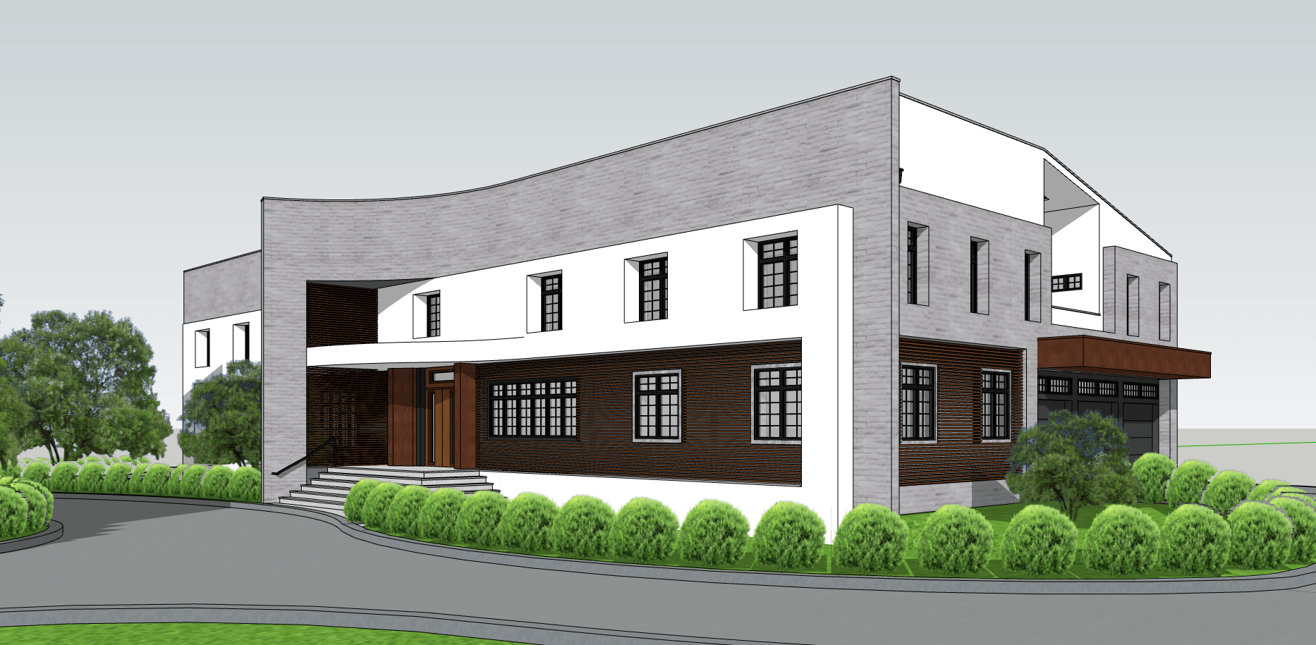
Diagnosis:   This very long house is essentially flat, broken only by a novelty curved stucco plane that peels away from the facade to signal the entry. The “cut and paste” window arrangement created a foreboding institutional feel, and failed to break up the facade in any interesting way, and like the first patient, the very high cover created by the curve would not protect the custom wood door from the sun, nor people from the rain.

The flat facade is in reality merely a screen created to hide the gabled roof behind, and give a more modern appearance, but in doing so, adds disproportionate height to the flat front. The oddity of this conceit becomes apparent on the garage entry side where you can see the gable awkwardly butting the front wall. Also on the garage side, the second floor recessed terrace opening dominates the elevation, but with no relation to the garage doors or any other part of the house.

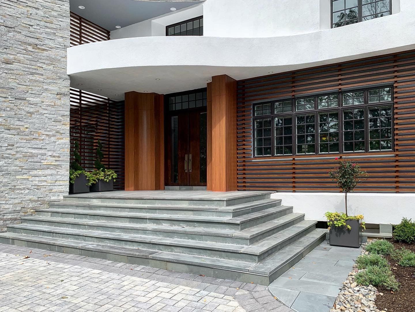
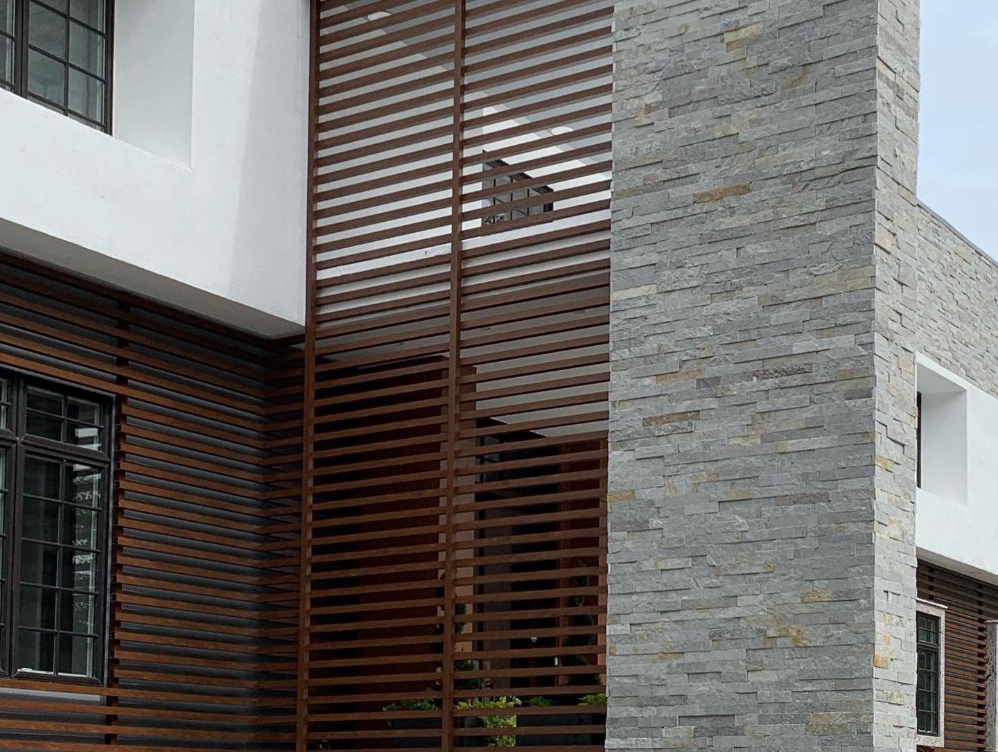
The Cure:   Our biggest challenge was to “domesticate” this oversized flat elevation and give it a more welcoming proportions. We proposed to build out from the facade in order to both create some depth and humanize the scale of the wall. Then, by cladding the original wall in stone, it has the effect of receding into a background plane, allowing the new white new stucco form to pop, as well as providing some welcome play of tones and texture. Wood look metal screening adds another layer of texture against the walls as well as a transparent divider that help draw the focus to the formerly neglected entry.

We created a curved canopy as a counterpoint to the original. This provides generous protection to the entry. The black granite pilasters and curved metal panels creates a more generous focal point against the large expanse of the front facade.

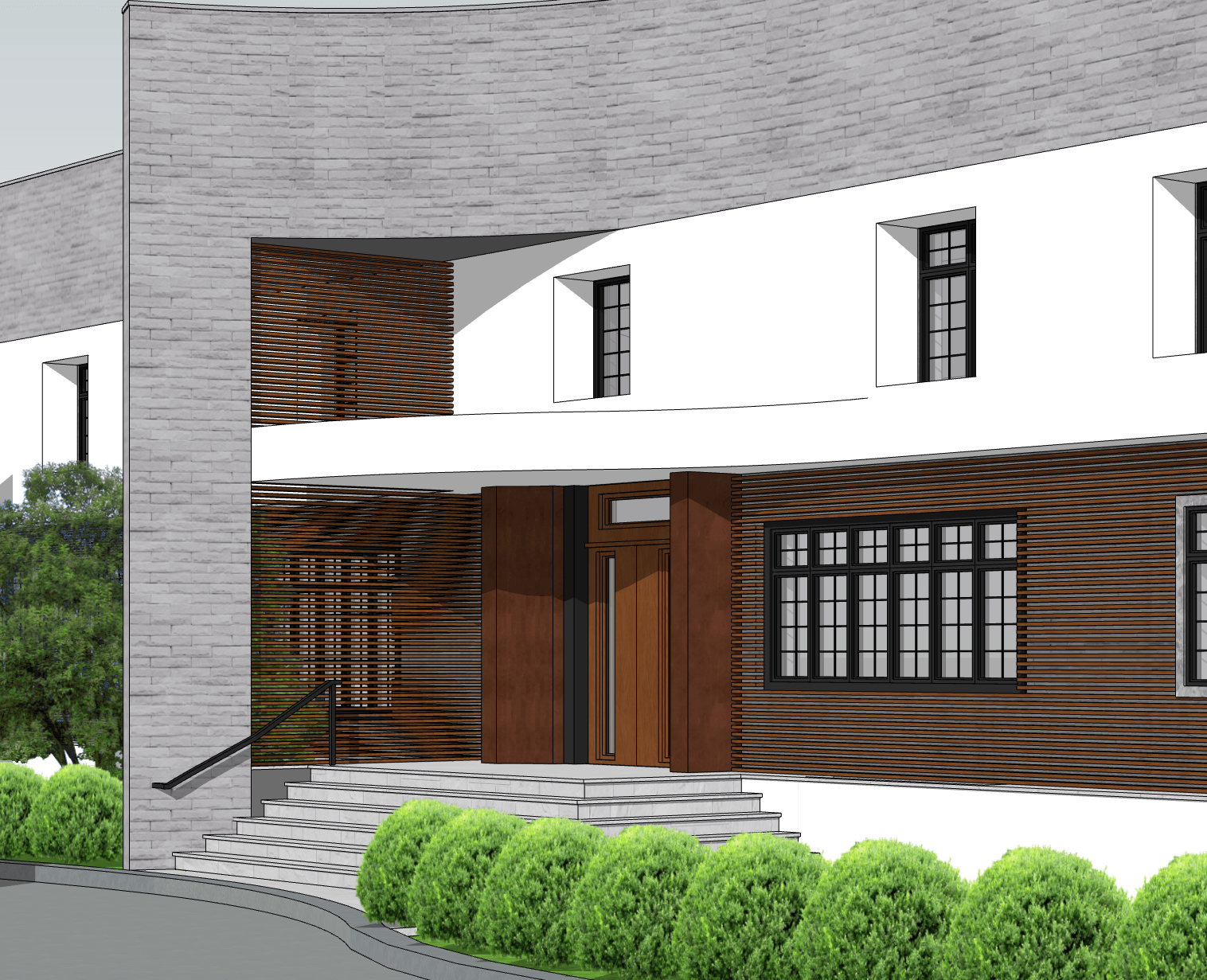
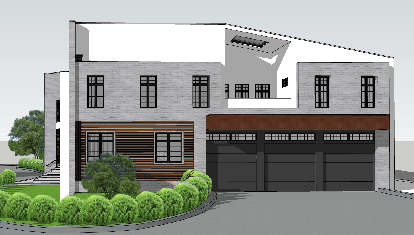
At the garage side, we created an infill wall to close the gap between the gabled roof and front facade. By infilling the wall at the recessed terrace to railing height, we bring the proportion of the opening down to a more secondary element in the design. A metal clad canopy over the garage doors provides additional dimensional relief. And here the metal screening, as counterpoint to the garage doors, helps to give more emphasis to the lower level.

After our initial doubts, It was gratifying to see how we had turned this anemic patient into a robust, healthy one.

COMPLETED PROJECT UPDATE!

I sometimes refer to split levels and ranches as “The Other Mid Century style”. They may not quite call to mind the classic mid century modern houses that have become so desirable, but with a little imagination, they do offer a great opportunity to create a modern home for this century.

I grew up in a 1958 split level house in suburban Philadelphia, and I remember even as a child recognizing the distinctively different feel from my friends’ traditional colonial houses. The more open plan, cathedral ceiling in the living room, and the 50’s decor seemed so cool by comparison. And the half flight up to the bedrooms and half flight down to the playroom seemed so easy compared to the conventional three level configuration.

Split levels and ranches became popular during the post WWII suburban expansion and reflected a desire for a more modern style home. The splits worked well on sloped or smaller sites, offering an open layout, yet more compact than a spread out ranch. In some homes, the arrangement allowed for cathedral ceilings in the living room since there was not a second floor above.

Somewhere along the way, split levels became something of a pariah. These houses generally lack both the design sophistication of a classic mid-century modern house from the same period or the character and charm of a traditional Colonial or Tudor. When found in neighborhoods with high land values, they often become tear downs that make way for more conventional Colonial style mansions. But from my experience and what I hear from local realtors, there is a growing demand for more modern homes, and these splits and ranches may be the best bet short of building a new house from scratch.

The split level modernization projects I’ve done have mostly included additions and exterior “curb appeal” makeovers. A common addition is adding a level above the one story portion, usually for a master suite and other related spaces. Addition on the back can create a larger kitchen or family room space. One project completely re-conceived the idea of a split level, and resulted in a dramatic home with the different levels intertwining in unexpected ways.


CASE STUDIES:


Englewood Cliffs, NJ

This client had hired an architect who completed the plans for a second floor addition. However, the client wasn’t happy with how the outside was looking, and asked us to re-design the exterior without making any big changes to the plans. The biggest design change we made was to change the gabled roofs to hip roofs, which immediately created a better resolution between the two wings of the house, and established consistent horizontal lines to the wall surfaces. The entry was given a cantilevered canopy, the bay window squared off, and the break up of materials further accented the horizontal connection between the volumes.


Tenafly, NJ

In this project, the client wanted to add a larger kitchen and family room to the back of the house, along with a new deck. This freed up space for a powder room and large pantry area at the living level. At the upper level, the space was reconfigured to provide a more generous master suite, eliminating one bedroom. A new bedroom and bathroom was added to the lower level in the area that had good window exposure. The existing entry sequence from driveway to front door was unwelcoming and included an un-needed circular driveway that was too close to the front door. Our design included a re-working of the front landscape.

This house already had hipped roofs, and our window and material choices helped to further modernize the overall look of the house.

These elevations show a different approach to material choices that I had presented, but the client opted for the black and white approach. 


Summit, NJ

The owners of this house had outgrown the space and embarked on an ambitious plan to enlarge the home and create a more modern expression. The neighborhood was full of these same style homes, but one by one, they were being torn down and replaced by the traditional style homes that developers were putting up around the state. For this project, we kept the original foundation and basic premise of the split level, and proceeded to create a modern home more in keeping with the mid-century spirit of the original. We had to submit for a variance to move the garage entry to the front of the house, and among the comments from various township departments was this very gratifying observation.

“The Historic Preservation Commission commends the owner and Architect for their proposed transformative design of one of the tract mid-century split-level homes- typical of the neighborhood- into a modern home in keeping with it’s mid-century influence. As an expression of its own time, the diagnosis is properly scaled to the neighborhood, and successfully addresses the site conditions, and utilizes material appropriate to their proposed use. We also like that the proposed design resists the common ersatz new-traditional inclinations that are becoming common in this neighborhood. No objections.”

The stair down was reconfigured to make a better flow from the new mudroom off the garage as well as new basement space under the rear addition. Setting the master suite second floor addition back from the front allowed a high ceiling area in the living room.


Scotch Plains, NJ

These owners lived in the neighborhood and were looking for an opportunity to create a modern, larger home nearby. This property met their need in terms of the location and the property size and character, and included a forlorn split level house that could easily have been a candidate for a tear down. Instead, we decided to retain some of the basic structure and proceeded to make additions and reconfigure space to create a home that took advantage of the various levels in ways that added to the interest of the architecture- resulting in a design that couldn’t have been achieved if a new two level house had been built instead of retaining the split level structure.

The two patios at the back also reflect the split-level nature of the house. The connecting stair follow the interior stair form the kitchen to the lower level dining/ living/ guest room spaces.

The lower level now has two stairs down, one from the entry foyer, one directly from the kitchen. The balcony space above acts as a private congregating space for the family, with a piano tucked in.

See this full project here.