Wright embarked on his own practice in 1893 after leaving the office of Louis Sullivan in Chicago. He went on to design many homes in what he called the Prairie Style, seeking to upend the traditional notions of house planning and design. Larger commissions ensued and his business flourished. However, a series of scandals, tragedies, and profligate spending, along with his notoriously abrasive manner, landed Wright in the position of a tarnished reputation and financial difficulty. Wright managed to restore his image following a series of prominent exhibitions of his work, but commissions for new work were slow coming. In 1932, he founded a school at his home in Taliesin, Wisconsin. One of his students was Edgar Kaufmann, Jr., the son of a wealthy department store owner in Pittsburgh. Edgar convinced his father to hire Wright to design a family vacation home on a site along a stream.

Completed in 1937, Fallingwater is perhaps the most iconic and recognizable modern building in the world. Noted for its dramatic forms cantilevering over the waterfall, the house was immediately revered and published internationally, and kickstarted Wright’s comeback as an architectural star.
It’s easy to wax poetic about the design of this extraordinary home, but something that intrigued me on the tour was the telling of the relationship between the architect and his clients. Wright had a reputation for being dogmatic, not open to compromise.
“Early in life, I had to choose between honest arrogance and hypocritical humility.
I chose the former and have seen no reason to change.” Frank Lloyd Wright
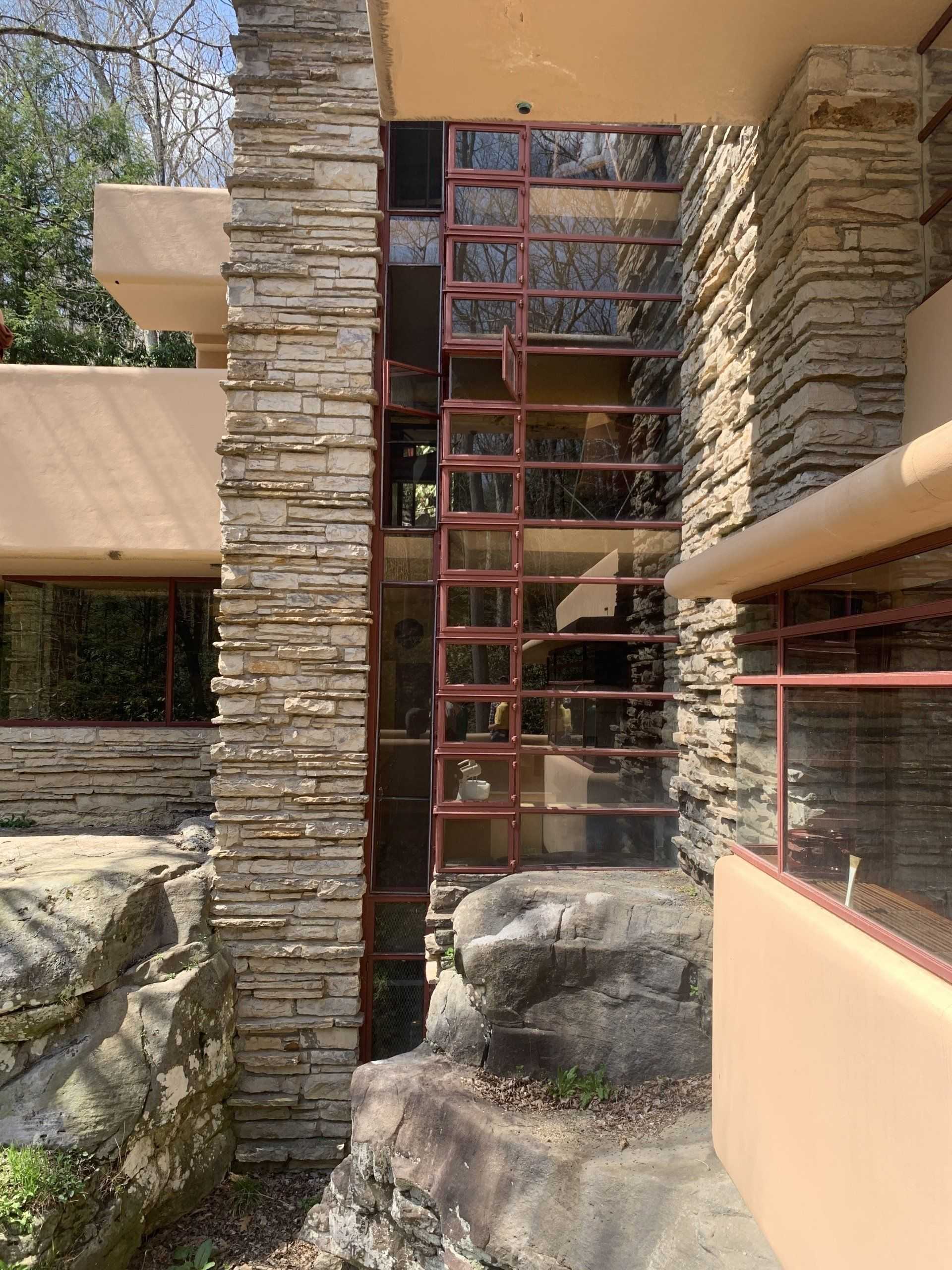
Yet in fact, the Kaufmanns asked for various changes in the original design, and Wright was apparently receptive to their requests. Access to certain rooms was re-arranged to suit the family’s lifestyle. Wright had designed groundbreaking corners windows into the design which were meant to be operable. The Kaufmanns, being familiar with the land, asked for screens so that they could have windows open without inviting in the array of bugs that would surely invade. Wright said they would detract from the view, but relented and designed them into the project. On the big issues though, he was more difficult. The builder and the client’s advisors were concerned about the structural integrity of the design of the extensive cantilevers throughout the house. Wright was convinced his design would work, but the clients decided to hire structural engineers to review the design. They determined that additional steel was required, Wright wasn’t happy, but the clients directed the builder to follow the engineer’s suggestions. In the mid 1990’s it became clear that deflection in the cantilevered terraces was still a problem, and engineers determined that even the additional steel that was added was insufficient. In 2002, floors were dug up so that new post tensioned high-strength steel cables could be installed in several areas.
A famous Wright quote that all architects chuckle over:
“A doctor can bury his mistakes but an architect can only advise his clients to plant vines.”
This structural mistake was not one that could be fixed with vines!

Corner windows with screens.
Kentuck Knob

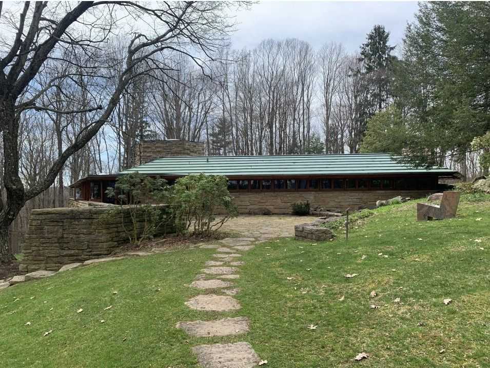
Low horizontal forms with large roof overhangs were features of Usonian homes.
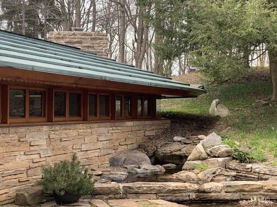
Wright’s Usonian homes were designed to be “affordable” for the middle class, this home was upscaled both in size and luxury of detail. The house nestles into the hill and presents a modest presence on the landscape.

“No house should ever be on a hill or on anything. It should be of the hill. Belonging to it. Hill and house should live together each the happier for the other.”
In this project, the clients requested some big changes from the original design, and perhaps because of his age and no longer needing to prove his point, he apparently went along with the changes graciously. Many rooms were enlarged, the original kitchen design was barely functional.
“Give me the luxuries of life and I will willingly do without the necessities.”

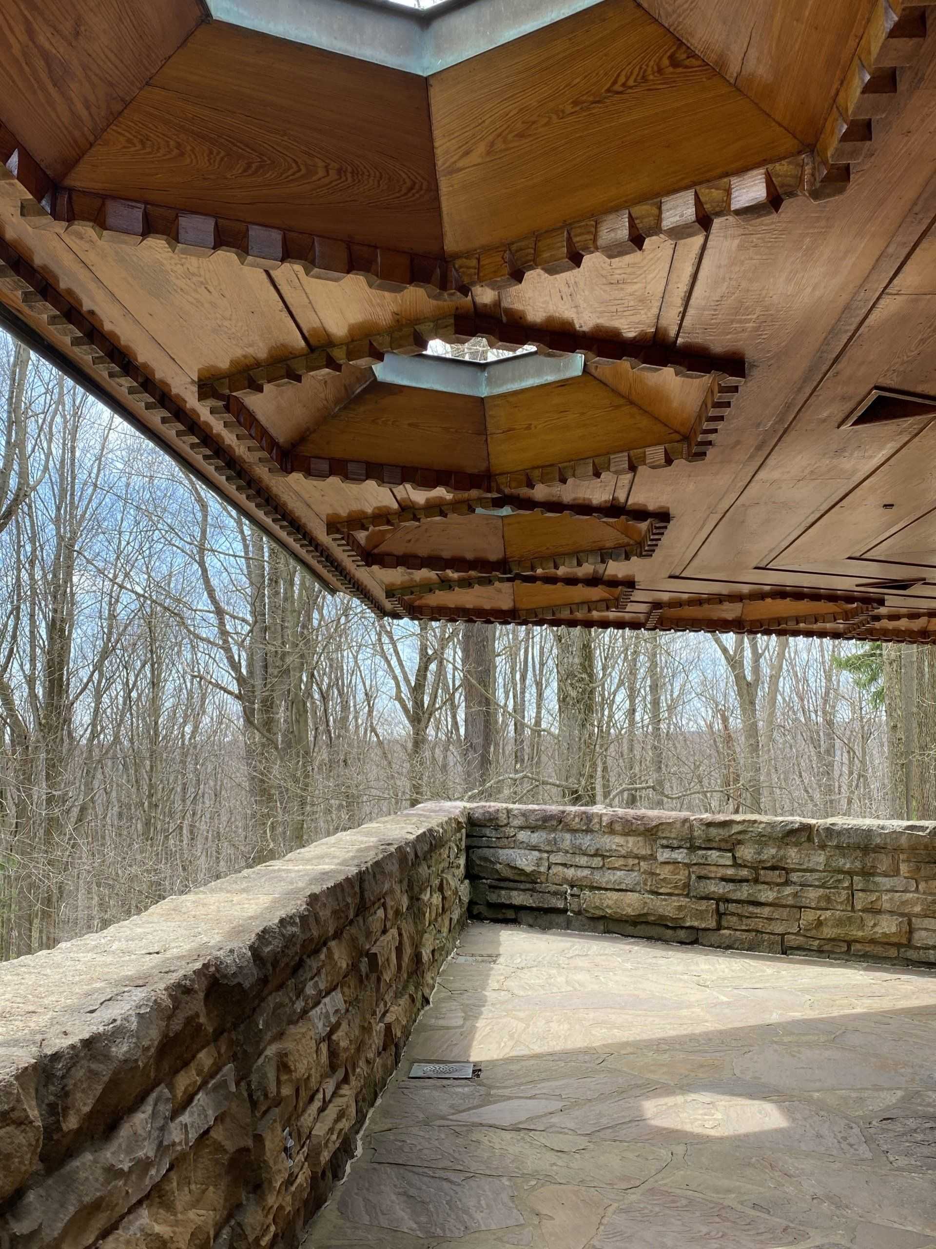
The skylit and ornamented balcony roof was a reflection of the upgrades to the standard Usonian design.
Wright’s original design called for the Cherokee Red concrete floors that were typical of the Usonian homes; the Hagan’s thought it looked like a warehouse and wanted the large scale slate floors they had seen at Fallingwater. Wright famously designed bedrooms as low ceiling spaces, the Hagans were tall and insisted on high ceilings in these rooms, and got them. The Hagans also got screens on their windows. The angular dining table Wright designed didn’t appeal to his clients, and they replaced it with an organic shaped table by George Nakashima.
“I have been black and blue in some spot, somewhere, almost all my life from too intimate contacts with my own furniture.”
A bit of honest humility to balance the arrogance.
I’ve always found on my projects that design changes to accommodate the needs and sometimes whims of my clients has generally improved the end result. This then pushes me to incorporate those into the project in a way that doesn’t compromise, and usually improves the design. Perhaps even FLW ultimately felt the same way.

