TENAFLY
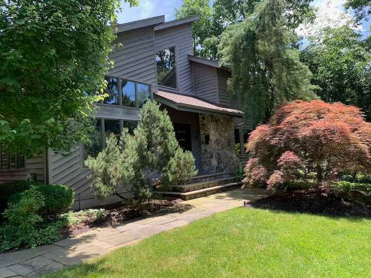
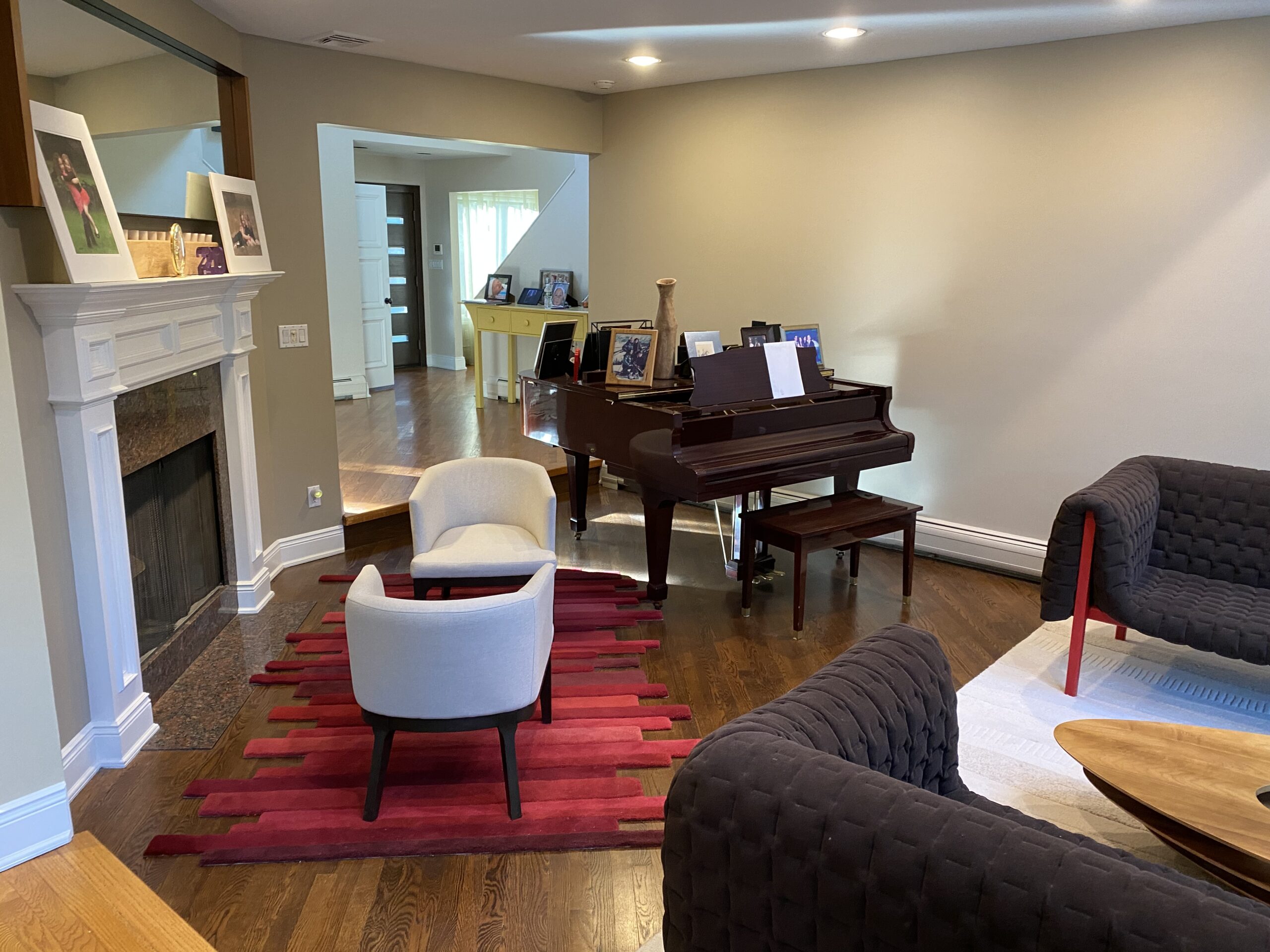
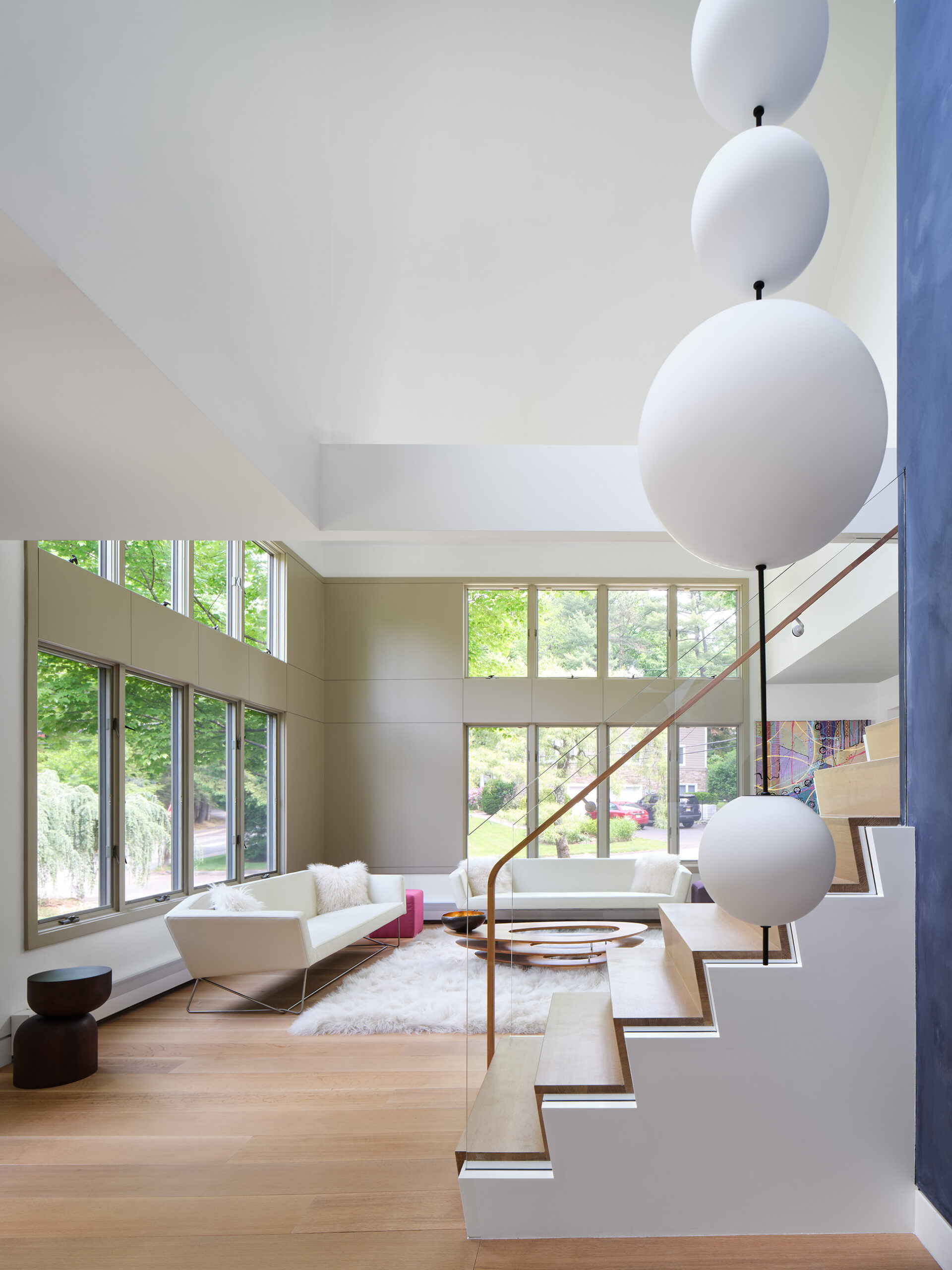
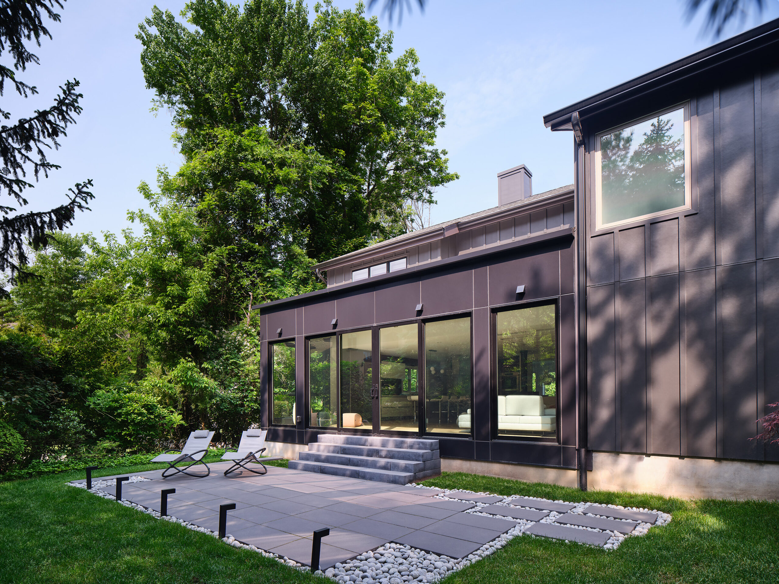
My clients had lived in this 80’s contemporary style home for many years and were eager to give it an update to better accommodate their needs as empty nesters. They wanted a more modern look on the outside, and more open space and daylight on the inside.
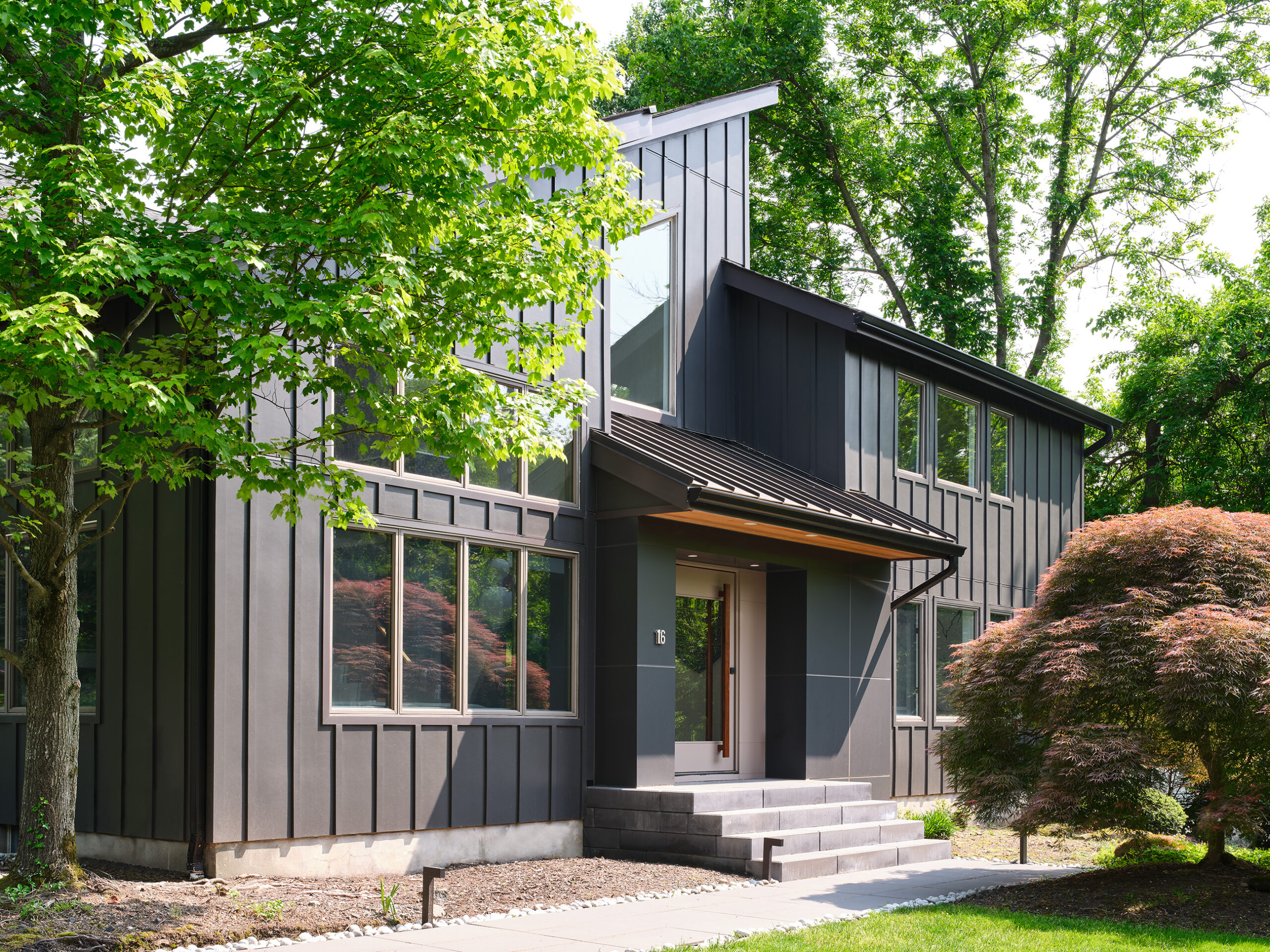
The whole house was re-sided, eliminating the diagonal design, for a more minimal and consistent appearance. The front entry was redesigned with the same intent.
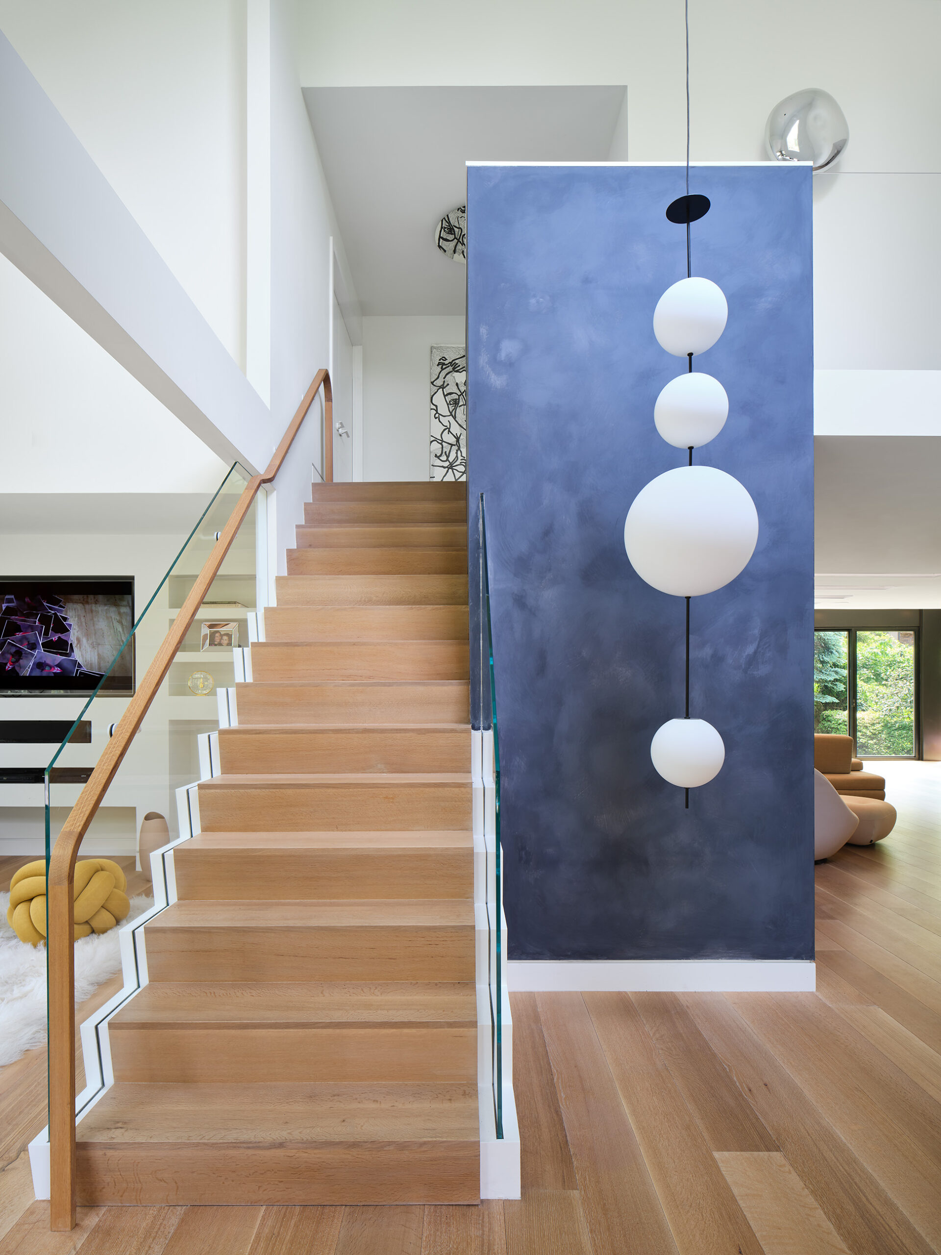
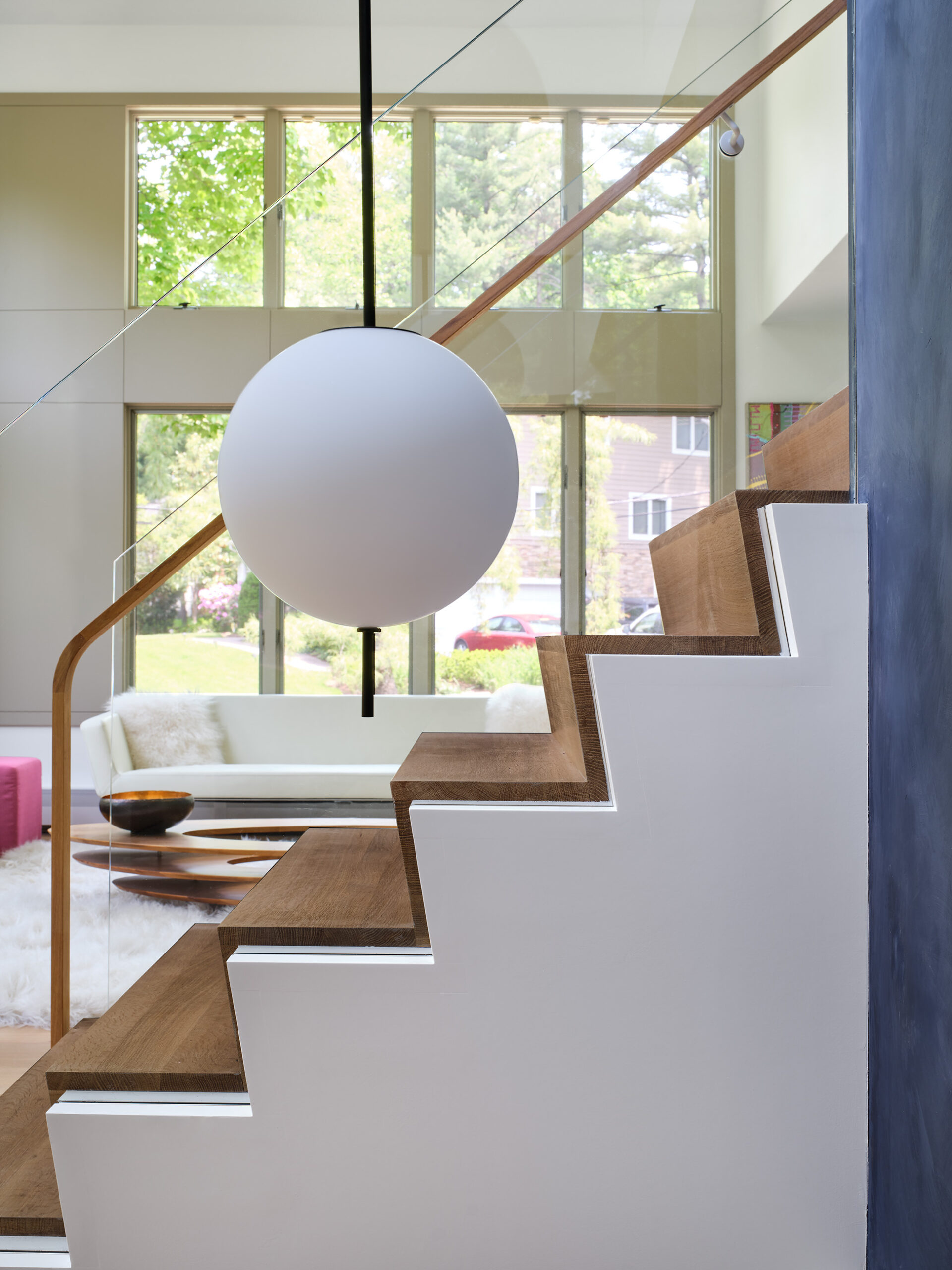
The wall between the stair and living room was opened up, and a more modern stair creates a strong focal point.
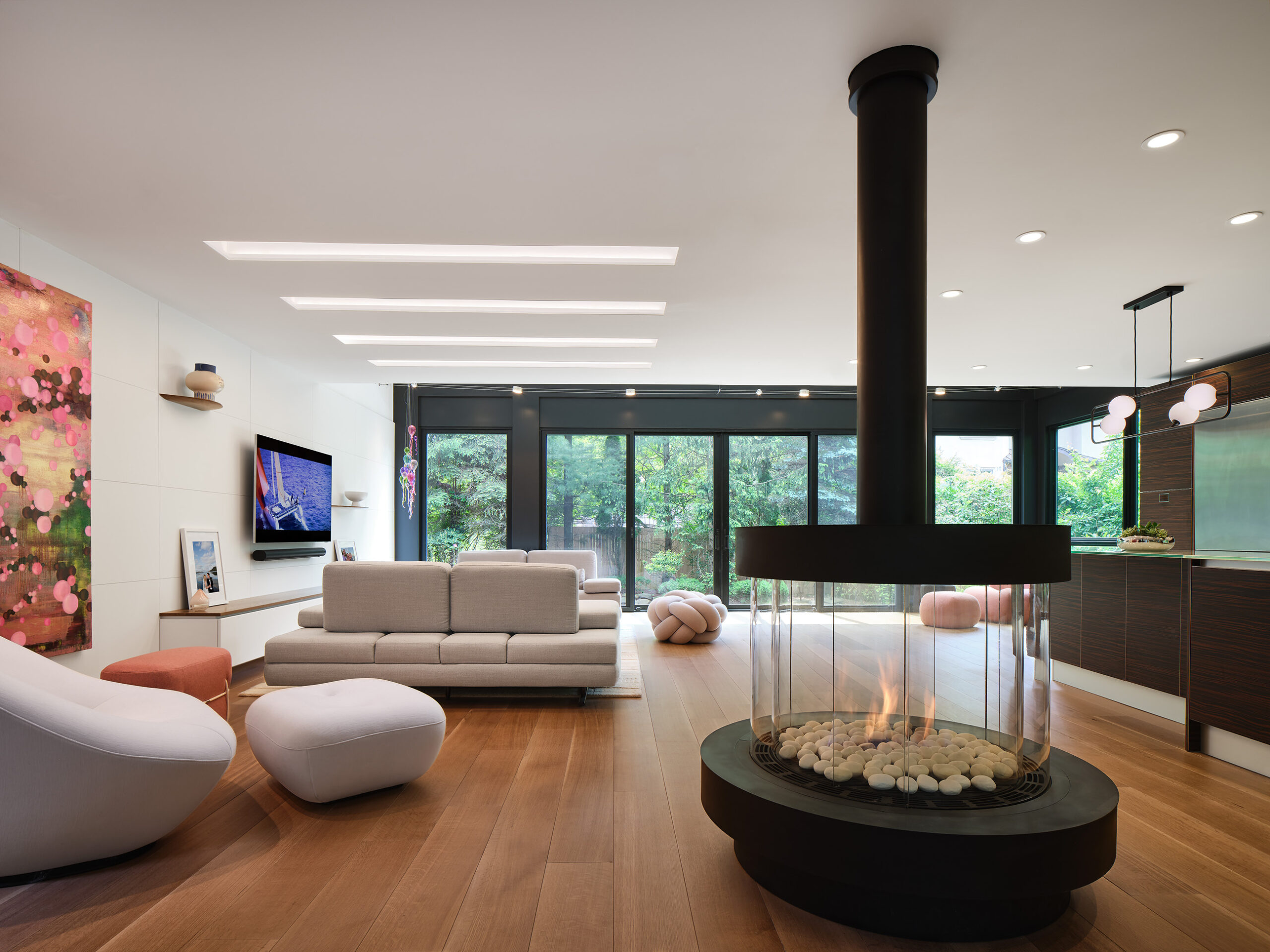
The family room was completely opened to the kitchen, and a small addition to the rear provides an open view to the back garden. The sculptural fireplace was placed so that the flue aligns with the previous fireplace chimney location.

