Home remodeling can be similar to surgery in that you’re hiring a specialist to cut into and rearrange your home. A diagnosis is made in consultation between the architect and homeowner, then a plan is developed about how to achieve the best results within the existing framework of the structure. Sometimes it is necessary to do some preliminary “surgery” to see what’s hidden behind the walls, and construction often has to be handled with care to not disturb the portions or features of the house that are to remain. The end result is meant to achieve a newer, better version of “the patient”. The process is quite different to building a new house.
In a previous blog post, I talked about the rewarding design challenges of doing additions to existing homes. Many of these projects also included remodeling of the home, but in this post, I focus on projects that are primarily remodeling within the footprint of the home. I love these types of projects, breathing new life into homes that contain a basic structure that is worthy of being preserved, re-imagining what is possible within a given context. There’s a joy in the puzzle solving exercise, and finding an elegant plan that comes out of the pre-described limitations.
“The greenest building is the one that is already built”
This quote by Carl Elefante, a former president of the American Institute of Architects refers to the idea that renovating or reusing existing buildings is more environmentally friendly than constructing new ones.
Why To Remodel
Homeowners have many different reasons to remodel. Those who have been in their homes for many years find that their lifestyle needs have changed, or that the house feels outdated in terms of the layout or style of the design. There may be a need for updated mechanical systems, energy efficiency, and overall comfort. New buyers find an older home in a location they love, but the house is in need of updates for the same reasons.
Kitchens and bathrooms are usually high on the list of priorities, as these spaces tend to feel outdated in both function and style, and may show wear and tear. Opening up spaces and creating better flow is also a high priority in many projects. Families use dining rooms less, and want the kitchen to be a functional center of activity and entertaining, no longer being relegated to a space closed off from the rest of the house. A more gracious primary suite is another highly requested remodel, and clients are often willing to sacrifice an adjacent bedroom to accommodate their desire for better closet space and a larger bathroom.
In the kind of projects I am usually brought in to assess, the exterior is another area where the design feels outdated and the materials need an upgrade. Windows may need replacing, (and while we’re at it, let’s add a few) and overall there is a quest to give the house a more modern look. This is particularly the case with ranches, split levels, 80’s contemporaries, and “post war” colonials.
In the following projects, let’s take a look at transformations that are possible with a little imagination.

80’s Contemporary
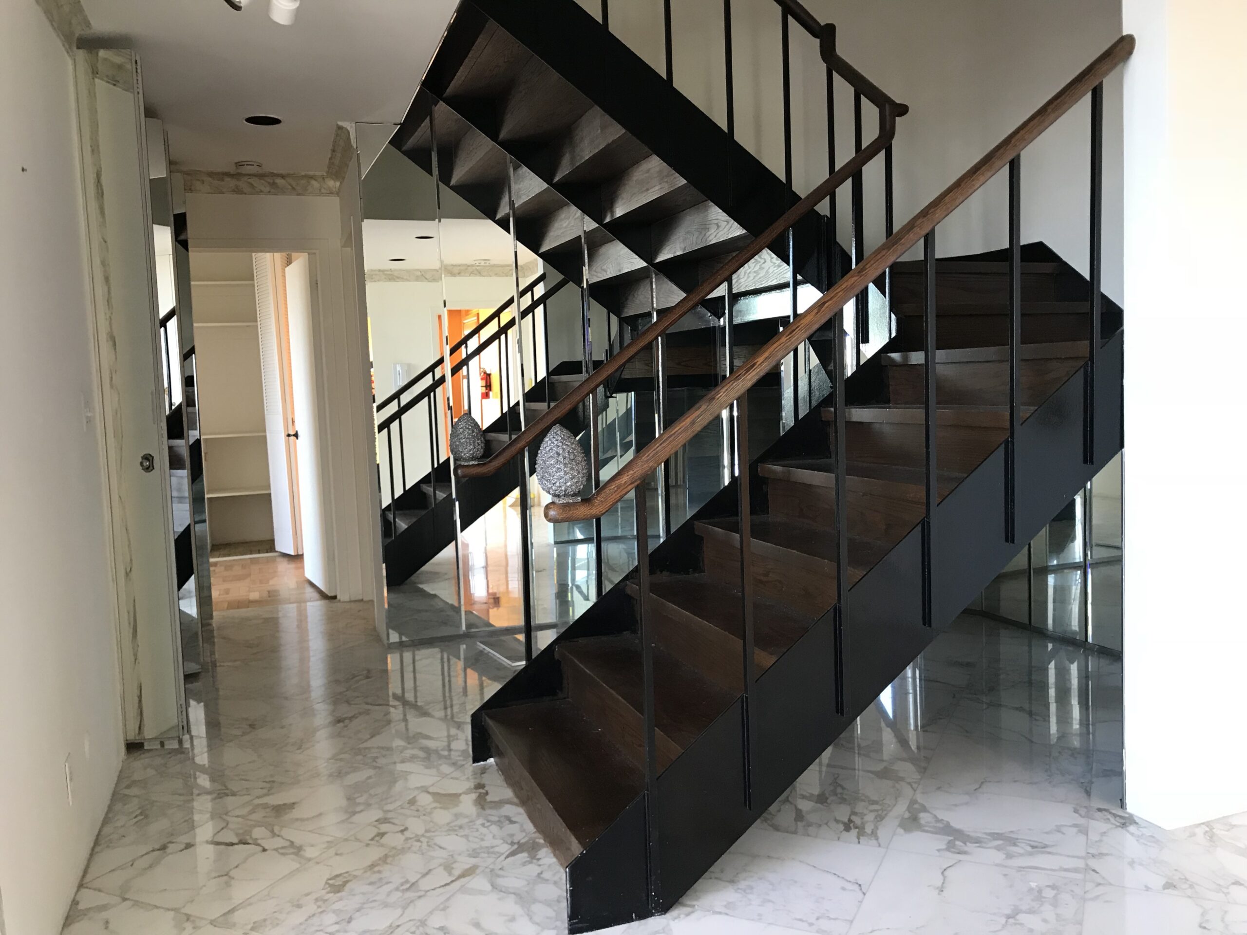
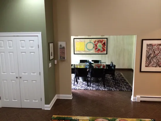
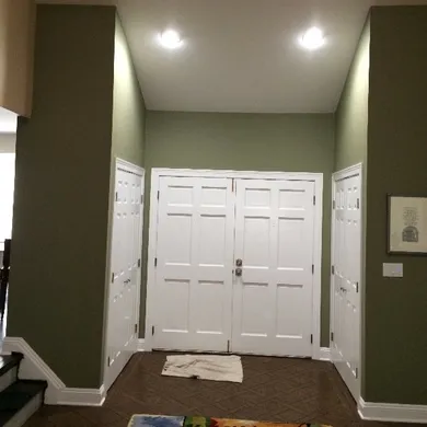
After many years in their home, the owners of this 1980’s contemporary were ready to update the function and look of their home. Although an ostensibly “modern” house, it was very disjointed with separate spaces without a sense of flow and integration. While the entry foyer was a double height space, it lacked character and just felt like a space to pass through.
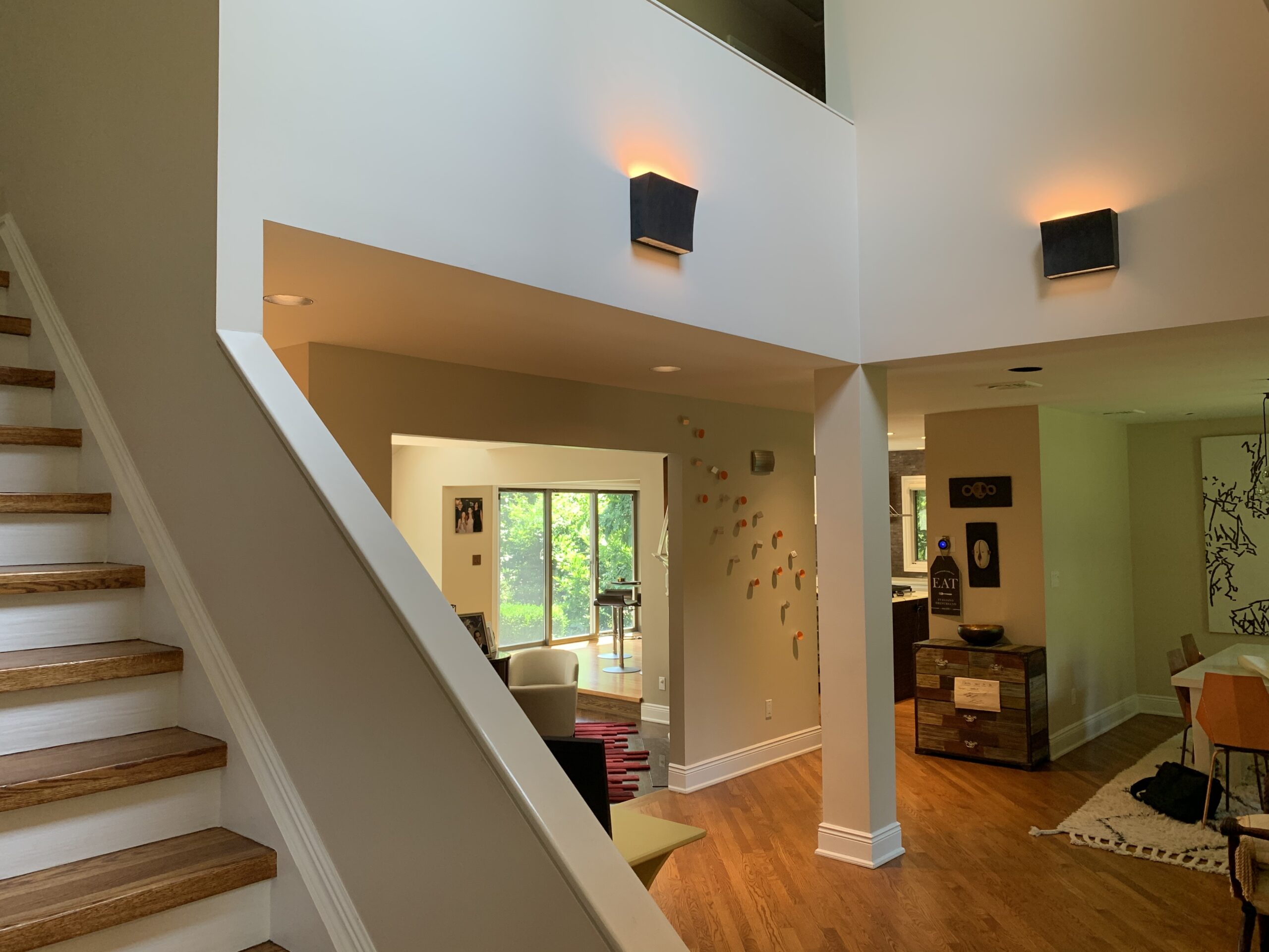
Original foyer and stair
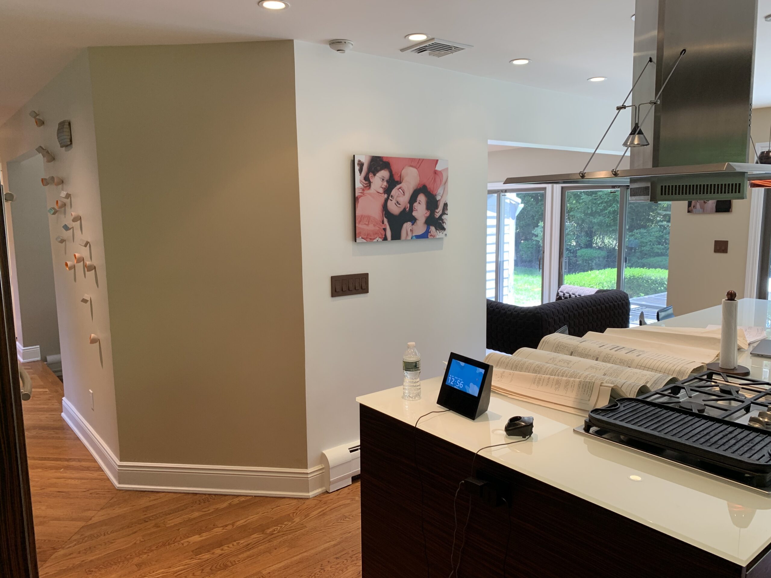
The living room was partially enclosed, creating a hallway off the foyer, and separation from the kitchen.
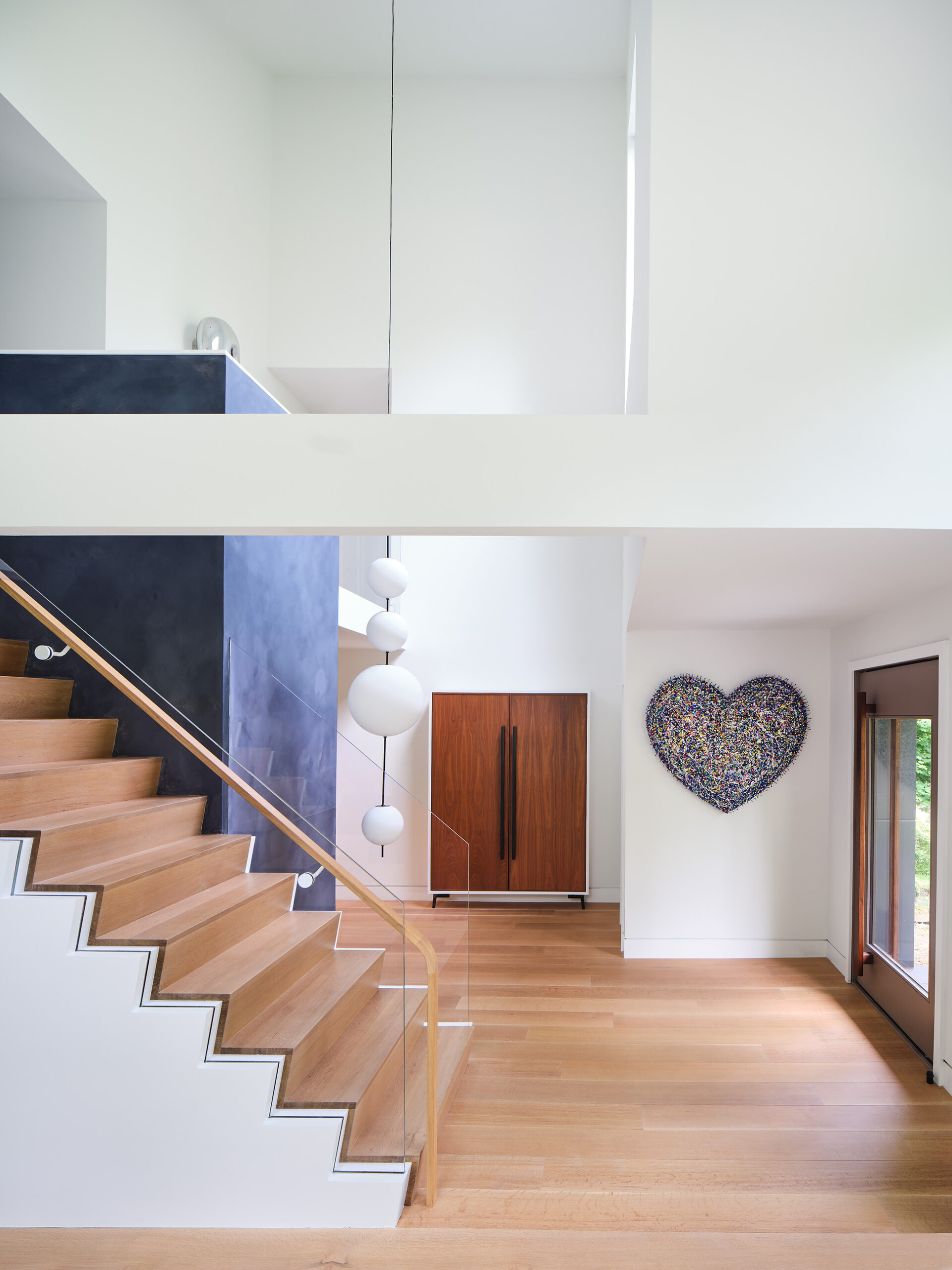
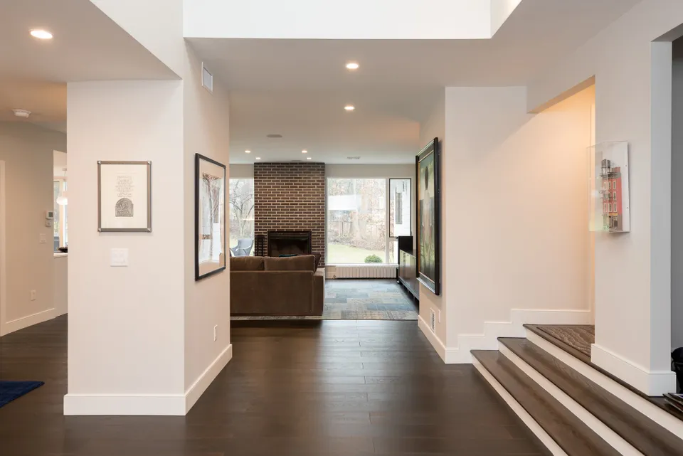
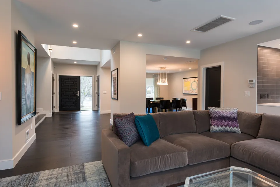
Opening up the wall along the stair, and reconfiguring spaces off the foyer created a bold, dramatic entry.
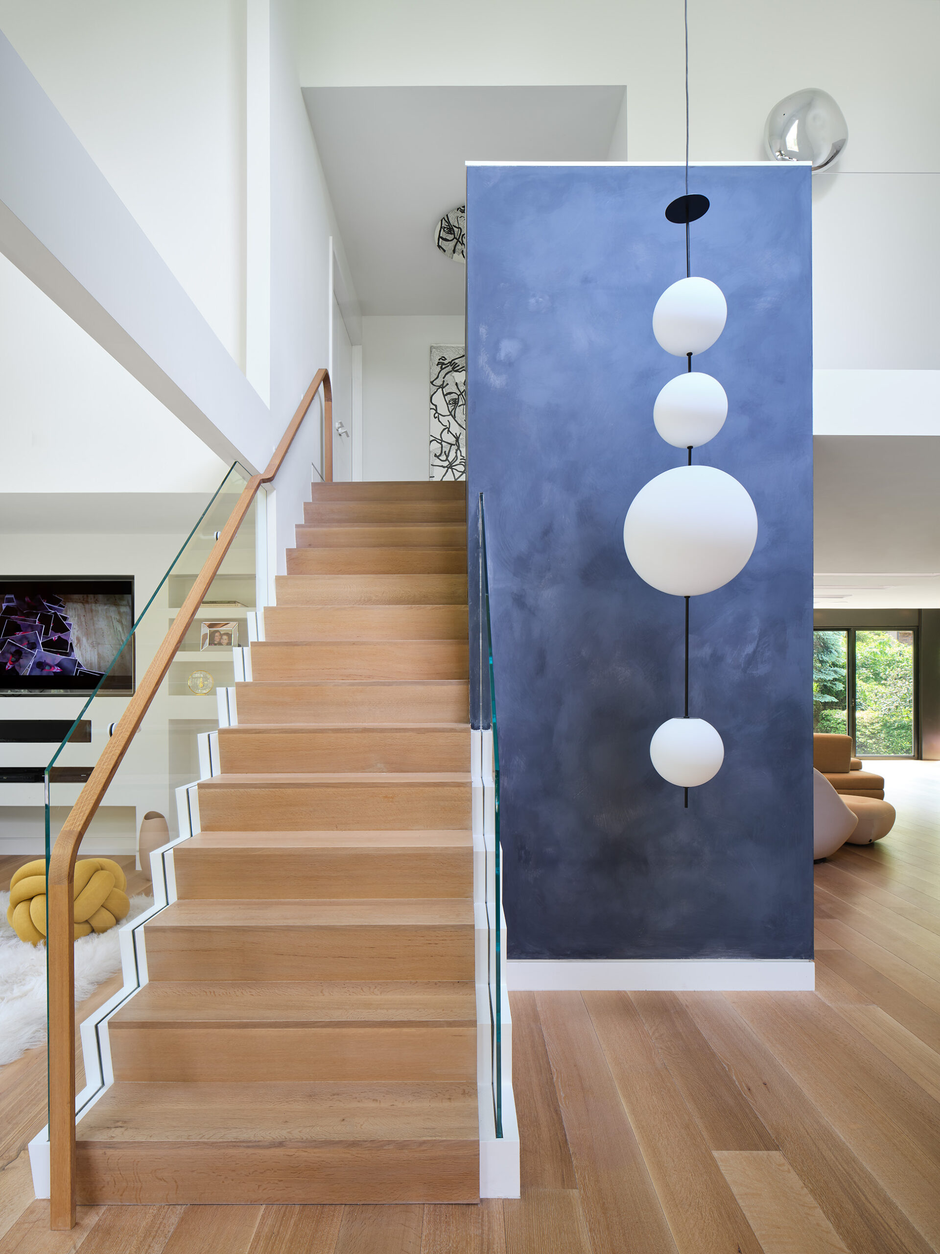
An elegant new stair becomes a focal point. To the left of the stair was a full wall separating a living room from the entry.

This sleek modern fireplace replaced the original traditional one. The living room is now fully open to the kitchen, with new doors and windows bringing in natural light and view to the back yard. Lighting troughs break up and add depth to the flat ceiling.
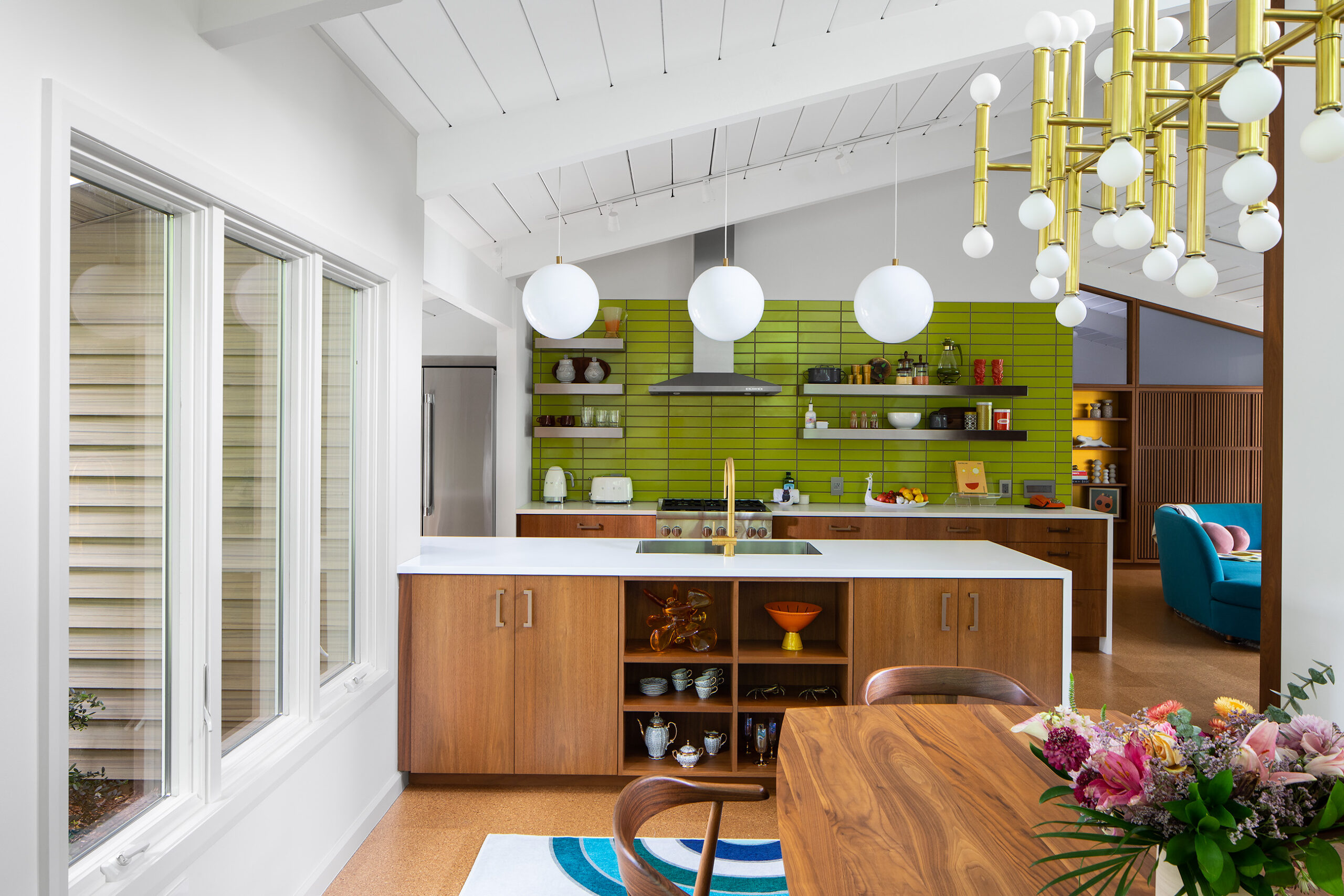
Mid-Century Update
This mid-century modern ranch was built as part of a unique cluster of homes in the 1950’s. The house had sporadic updates since, but my clients were ready to give the house a total interior refresh to bring it to new heights. They wanted to maintain the mid-century character of the house without being slavish to retro styling. The architectural changes were more surgical rather than a total gut. The spaces were subtly enhanced by finding the best expression of the existing structure, and then applying well considered and unexpected finishes throughout.
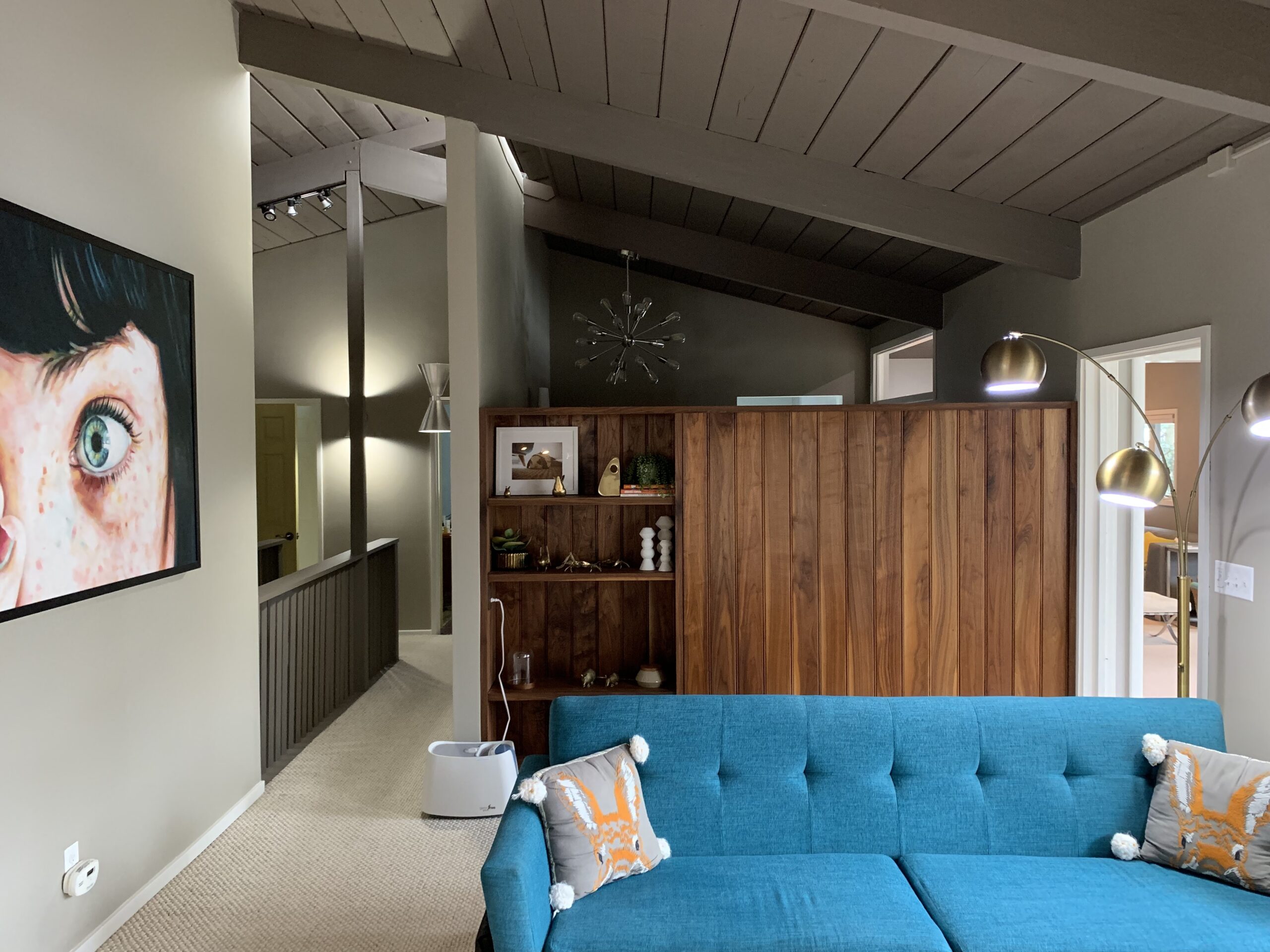
A low wall separated the living room from the primary walk in closet.
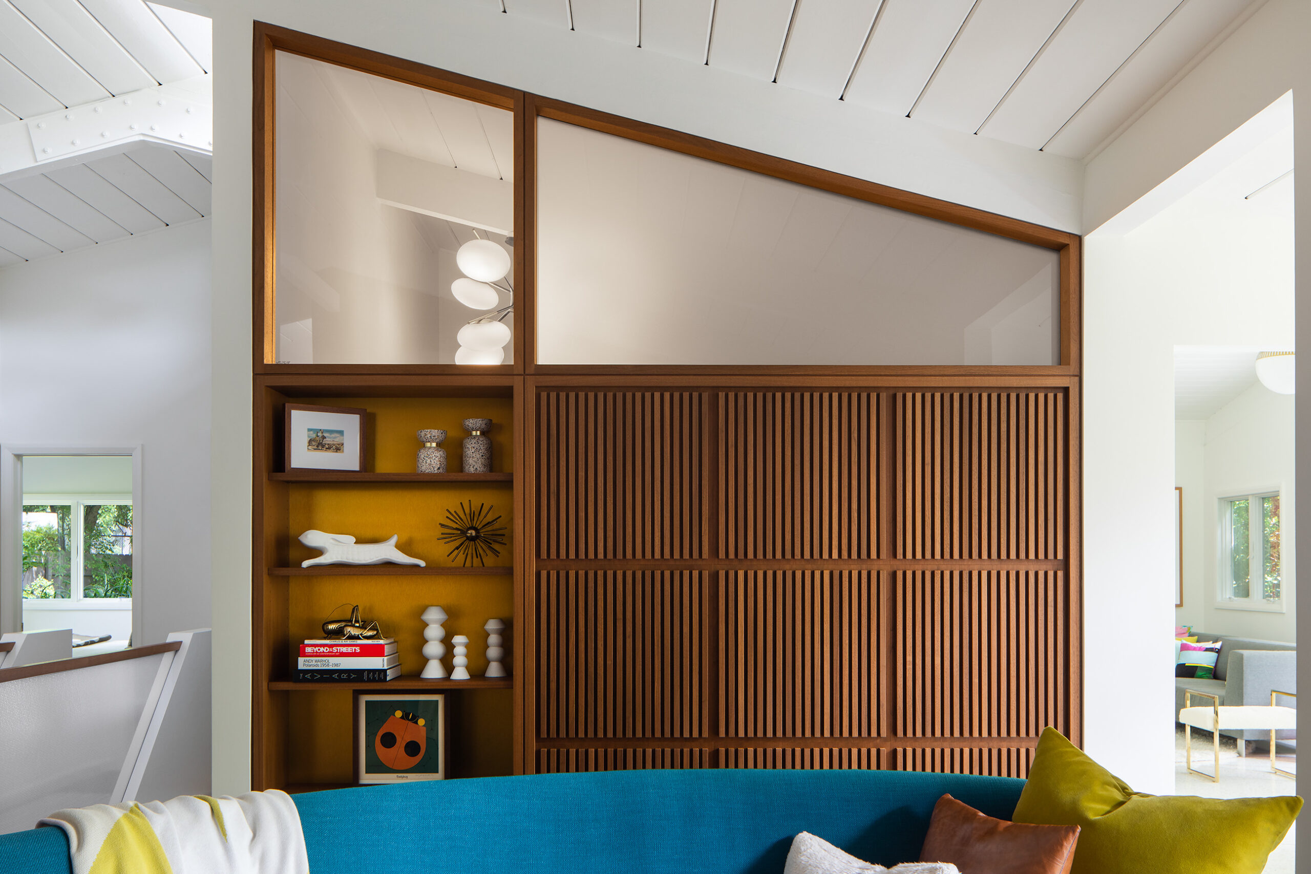
We created a full enclosure above the new wood panels, combing clear and frosted glass. The opening to the right was widened and lifted to the beam height, resulting in a more cohesive composition and a brighter space.

Original stair
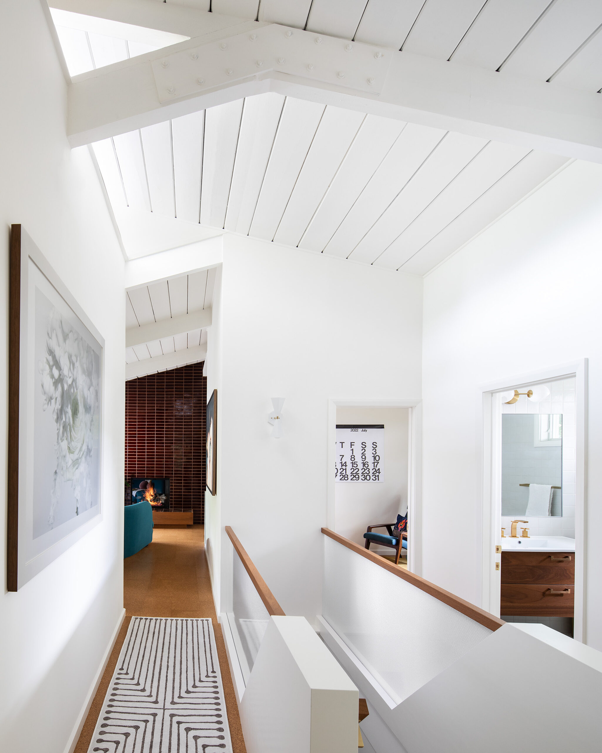
Note the missing post. As simple steel plate reinforced the structure and eliminated the need. A dynamic new guardrail features translucent resin panels that cast a soft glow.
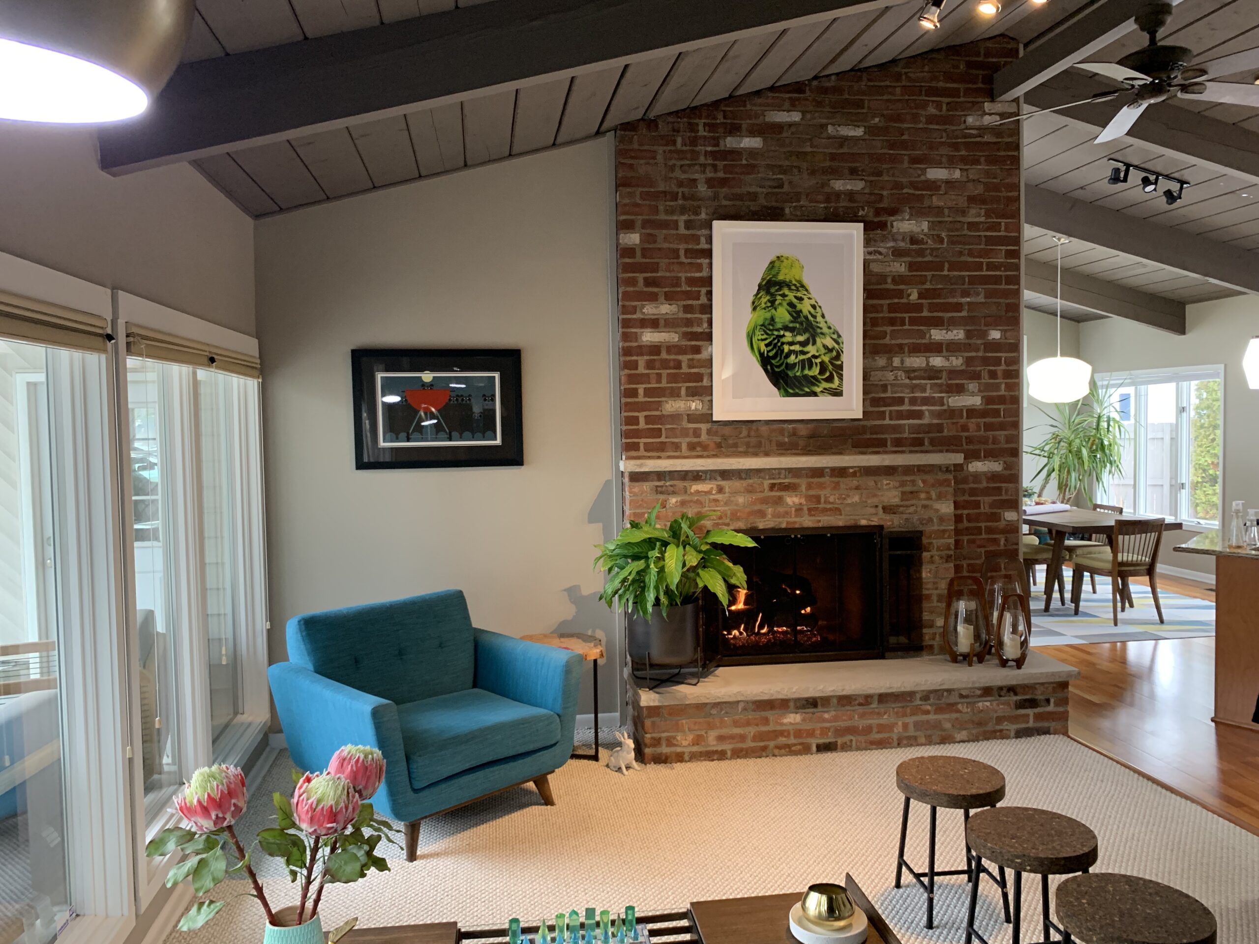
The fireplace composition was clumsy. The brick didn’t relate to anything else in the house, inside or out.

We removed. the mantel, covered the bric with new tile and extended it to better surround the firepalce. The hearth appears to hover over the floor.
Dream Penthouse
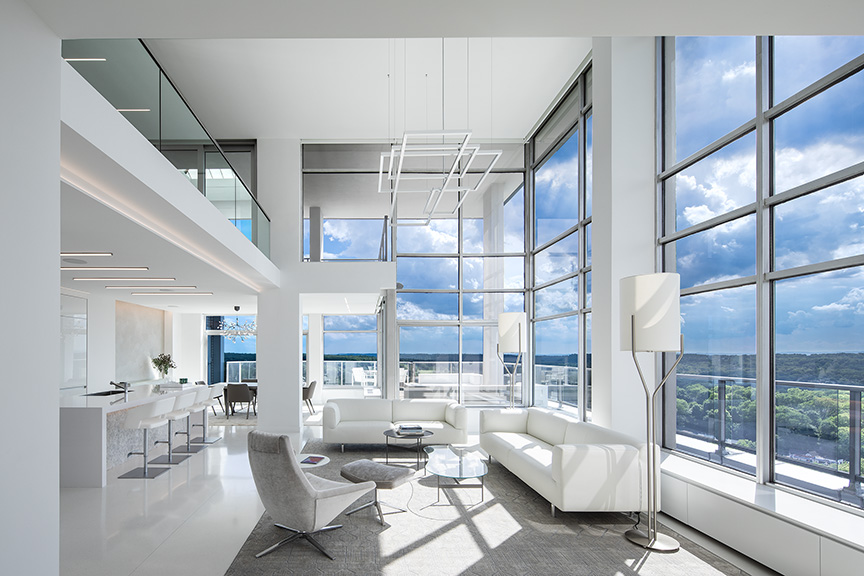
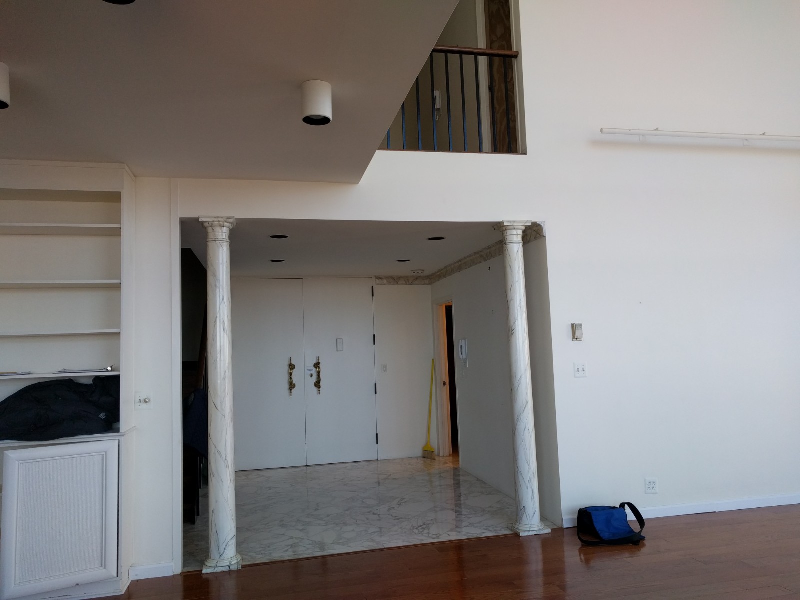
Looking at the finished photos of this amazing penthouse condo, it is hard to imagine how dreary the original space was. The double height living room was there, but nothing else related to it. The kitchen was in a dark closed off space, and the rest of the apartment was a series of rambling rooms. My clients bought the space knowing that they could transform this into their dream home and create a complete transition from their colonial house nearby.
Every wall and surface, except the windows, was re-conceived to create a minimalist interior that reflected the client’s desire to pare down their “stuff”, but to do so within a luxurious surrounding.

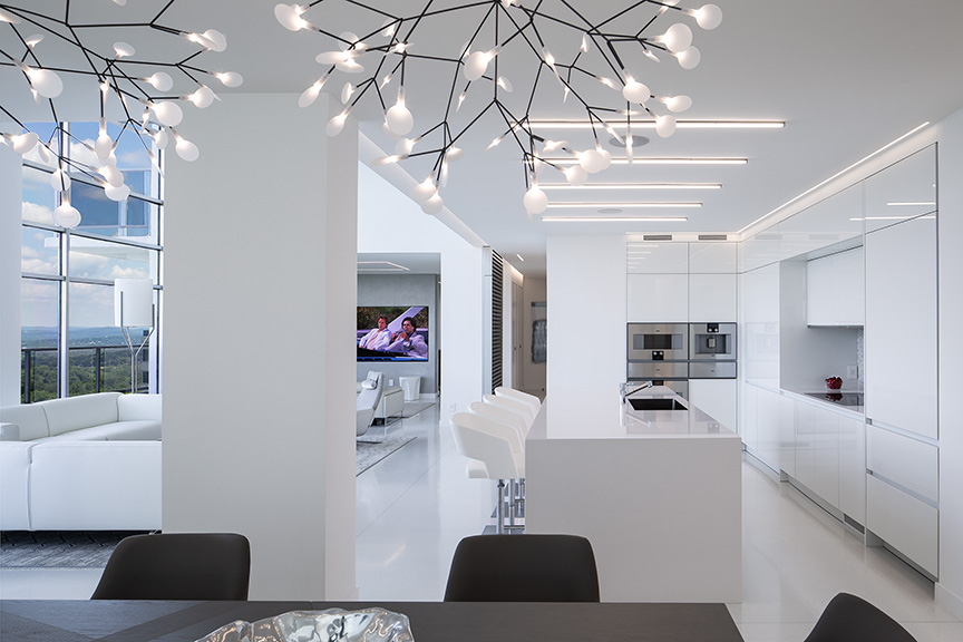
Sleek fixtures, finishes, and carefully considered lighting, creates a dynamic, minimalist space that reflects the Client’s vision.
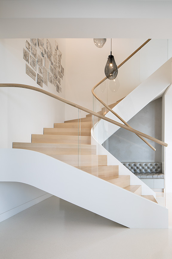
This elegant new stair reflects the lightness and minimal detailing carried throughout.
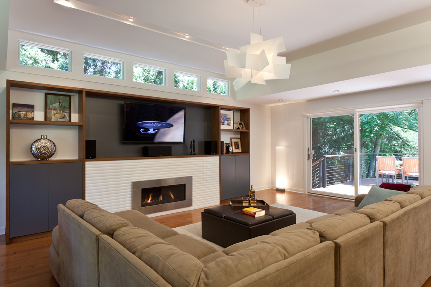
Ranch Re-do
The buyers of this ranch home loved the location and there was enough space for their growing family. But they wanted a more modern, open feel and the 1960’s house was ready for general updates.
Not surprisingly, we opened up the kitchen and family room to create a large family space. We took advantage of space in the roof to add height and light. We were able to carve out some upper level attic space to expand the Primary Suite, enlarging the bathroom and creating a substantial closet area. Fixtures and finishes were upgraded to make the most of the new spatial arrangements.
Exterior modifications were limited, a new custom entry door, some new windows and thoughtful landscaping took the house from ordinary to eye-catching.

The house was hidden by overgrown landscaping.
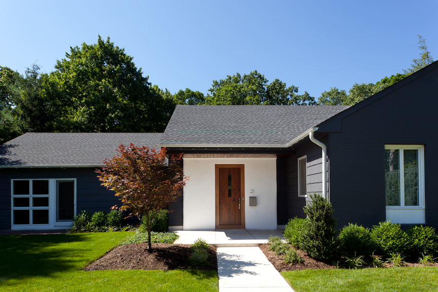
A re-designed entry way, shutters removed, new paint and landscaping provide a more welcoming face to the street.
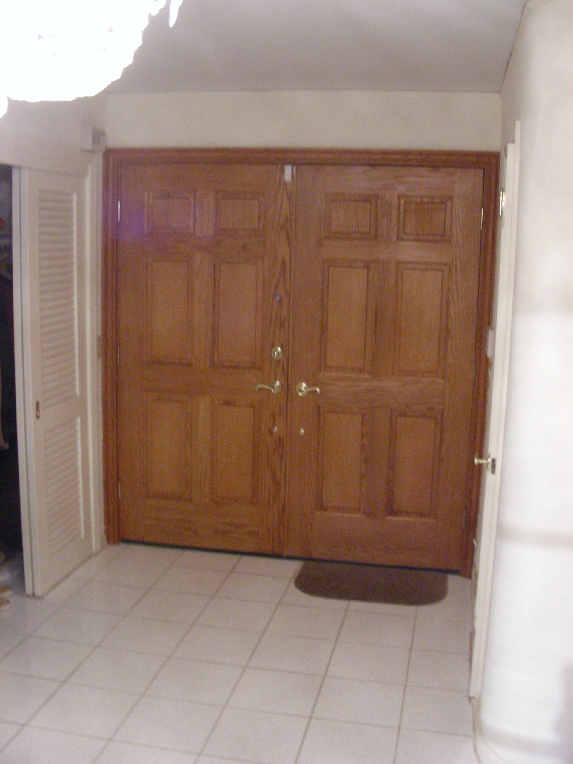
Original front entry
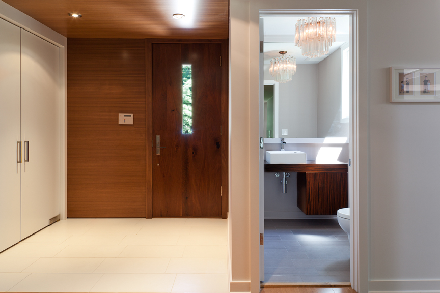
A new custom door with matching wall and ceiling panels provide an upgraded entry experience.
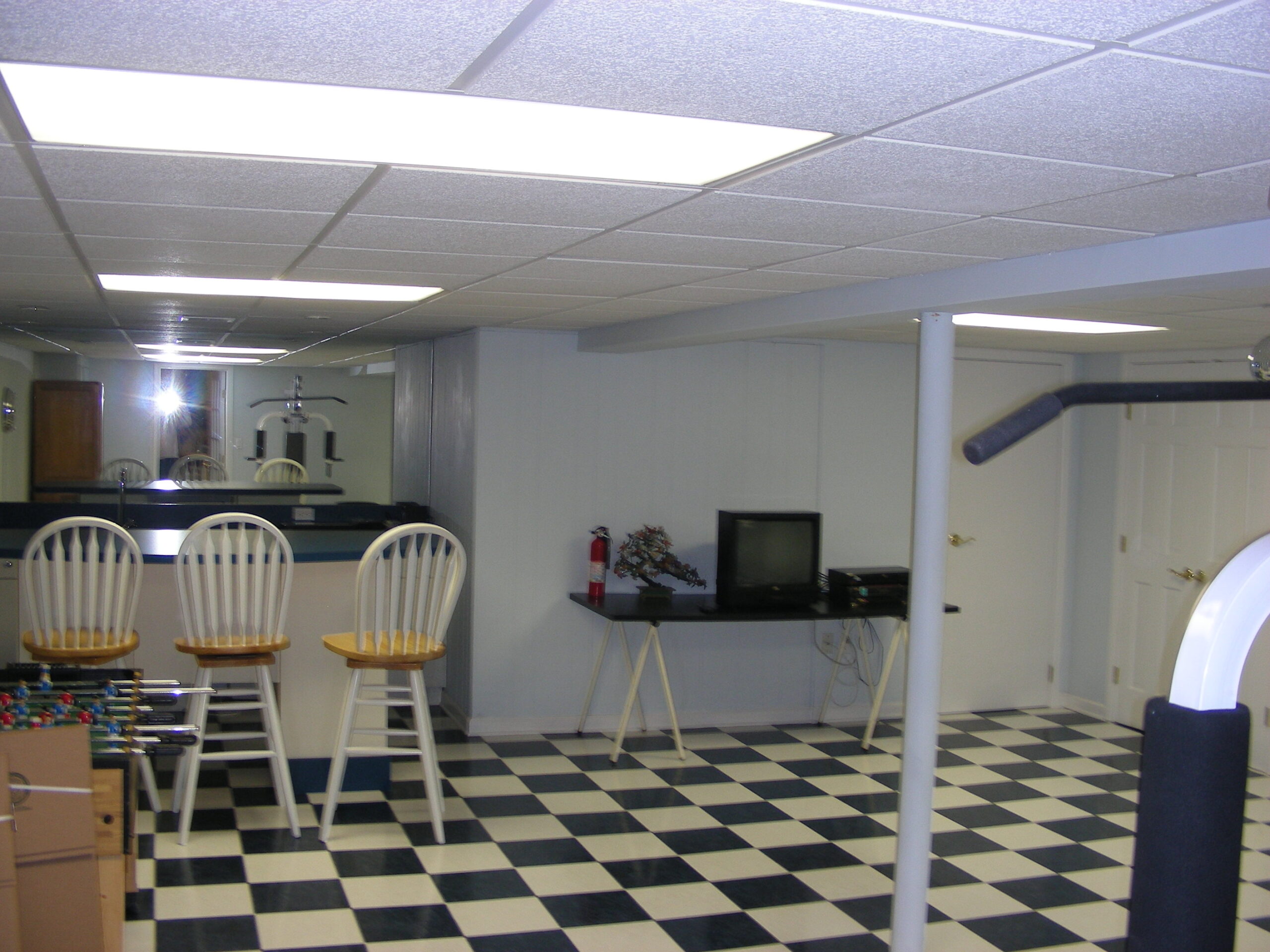
Original basement
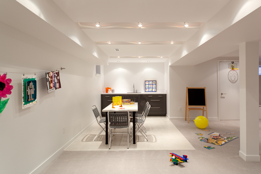
We took advantage of any ceiling areas where we could gain some height. The recessed light coves add even more depth and sculptural interest.
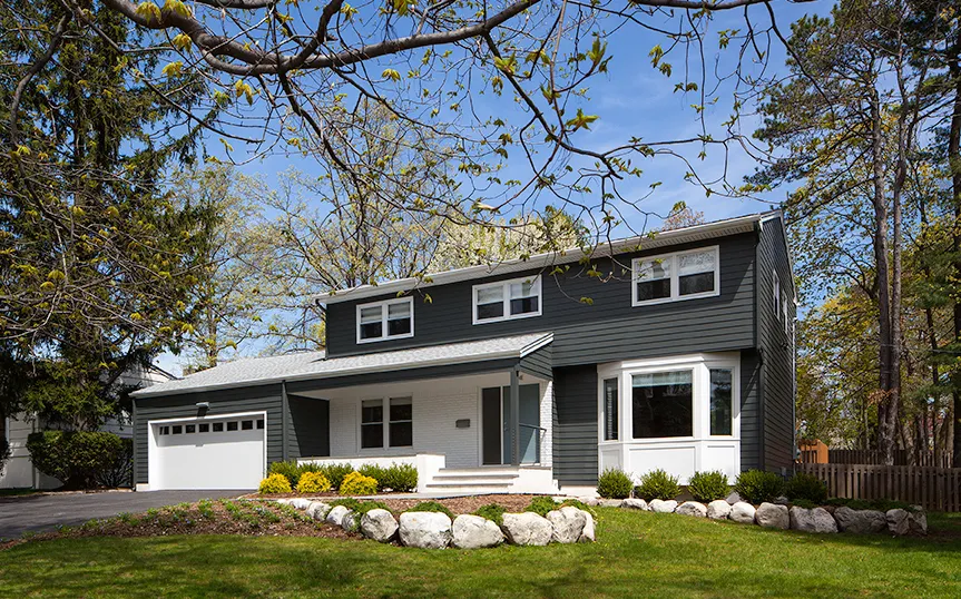
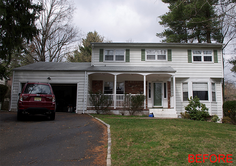
Colonial Update
A more modern look for a basic colonial. New siding and some simple structural work gave the house a fresh appearance.
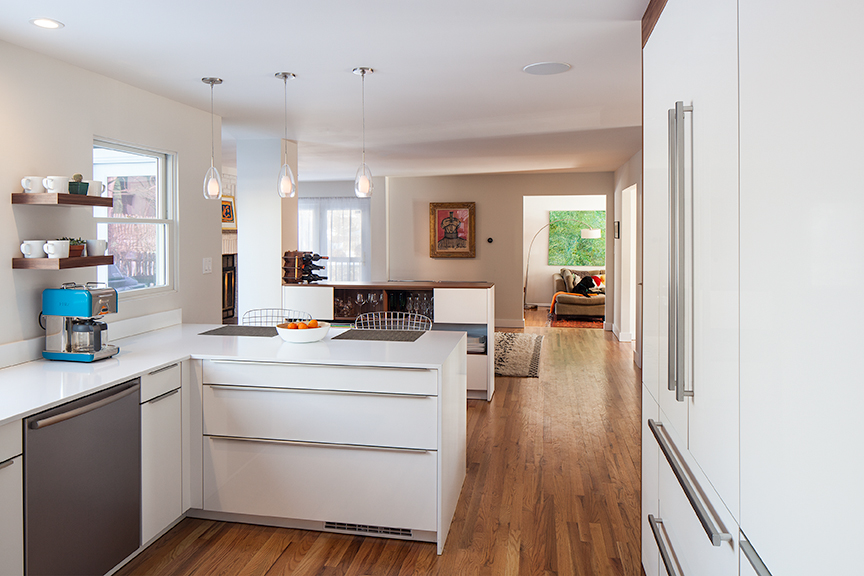
Inside we opened up some space between the closed off kitchen and family room.
Another Ranch Re-do
In this full remodel, a tired looking home was given new life. Spaces were opened up and strong architectural elements created definition.

Everything now flows together.
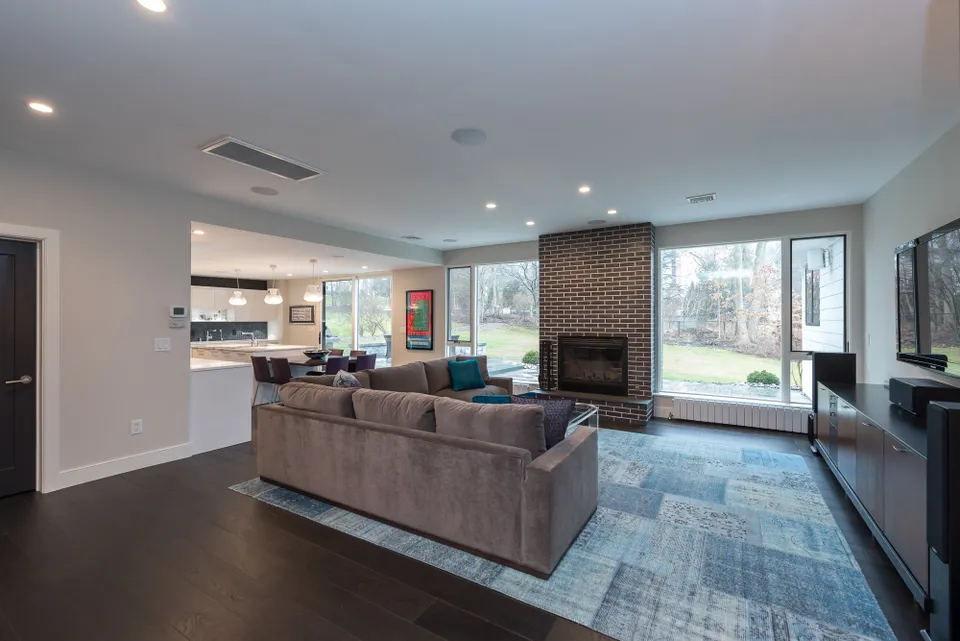
A new fireplace anchors the living room and is visible form the eat-in kitchen.

